
Table of Contents
Introduction
Data Gathering
Data Ethics
Munging, Wrangling, and Cleaning Data
Analysis
Conclusion & Key Takeaways
Sources
Introduction
Welcome to my data science tutorial, where I will guide you through this fascinating world and its application in analyzing professional basketball. The goal here is to unveil the “magic” of data science and regression analysis, demonstrating how they can be used to predict the performance of NBA teams accurately. This tutorial is designed to take you on a journey through the realm of NBA statistics, where the analysis of comprehensive datasets has become an indispensable tool in shaping team strategies, player development, and making crucial financial decisions.
Throughout this tutorial, I will explore the statistical analysis of NBA team performance using a dataset that encompasses a broad spectrum of team features, including scoring patterns and defensive capabilities. You will learn how to apply data science methodologies to analyze a rich dataset effectively. We will delve into identifying key predictors of a team’s win percentage, a process that involves using historical data to forecast a team’s future success accurately.
The focus will be on understanding and implementing two types of regression models — linear regression(3)(7) and Ridge regression(1)(2)(4)(5)(8) — and unraveling their significance in making predictions. You will get insights into how multicollinearity affects the predictive models and how Ridge regression addresses this issue. Also, you will see firsthand how standardization plays a role in preparing our data for these models.
By the end of this tutorial, you should have a deeper understanding of the game of basketball from a data science perspective. This knowledge is not just academically fascinating; it equips team managers, coaches, and analysts with crucial insights, enabling informed decisions that could be the difference in a highly competitive sporting environment. Whether you are a data science enthusiast, a basketball fan, or someone interested in the intersection of sports and analytics, this tutorial is designed to offer you both foundational knowledge and practical skills in sports data analysis.
Data Gathering
In data gathering for data science, web scraping is a prominent technique used to collect data from the internet. A web scraper is essentially a program that downloads and processes content from the web. When considering a specific sports website for data collection using a language such as Python, setting up a web scraper involves several detailed steps.
Before we examine these steps, I wanted to familiarize you with the concept of a web crawler, which can be used to navigate through websites. It is essentially a bot that systematically browses the web to identify and access pages containing the data of interest. In the context of a sports website, it might be programmed to access specific sections like game results, player statistics, or team profiles. Once the crawler reaches the relevant pages, the scraper comes into play.
To set up a scraper for a sports website, you could use a Python library such as Beautiful Soup. It is designed to parse and extract structured data from HTML content. For instance, if you are scraping a basketball statistics website, your scraper would be coded to identify and extract specific elements, like tables of player statistics or scores from games, based upon patterns in the HTML.
This process involves:
1) Sending an HTTP request to the webpage URL.
2) Parsing the HTML content of the page, which is received in response.
3) Identifying the HTML elements that contain the data you need. This might involve inspecting the webpage to understand its structure, such as finding the specific tags, classes, or IDs that enclose the desired data.
4) Extracting and storing this data, typically in a structured format like CSV or JSON, or directly into a Pandas DataFrame for further analysis.
This setup allows for targeted extraction of data from specific parts of a website, making it a powerful tool for collecting up-to-date sports data. However, it is crucial to be aware of the applicable legal and ethical considerations, as not all websites permit scraping, and heavy scraping activity can burden a website’s servers.
In the United States, there are four primary legal grounds(13) website owners might invoke to restrict or prevent web scraping:
1) Copyright Infringement
In the United States, copyright protection is “automatic” and extends to online content. Fair use also applies online, as well as the concept of the public domain. While the direct duplication of original expression is often illegal, the U.S. legal system, as evidenced in the ruling of Feist Publications, Inc. v. Rural Telephone Service Company, Inc., allows the duplication of facts. This distinction is crucial for web scraping projects focusing on data and facts rather than creative expression.
2) Computer Fraud and Abuse Act (CFAA)
This act prohibits accessing a computer without authorization or exceeding authorized access. Therefore, scraping data from websites that require authorization or breaching any access barriers might fall under this violation.
3) Trespass to Chattels
This legal claim involves intentional interference with another’s personal property and requires proof of actual damage. In the context of web scraping, this could relate to activities that harm a server’s functionality or impede its intended use.
4) Terms of Service Violations
While not criminal, breaching a website’s terms of service can lead to contract breaches and subsequent legal actions, such as the removal of content obtained through scraping from your project.
To ensure legal compliance in a web scraping project, one should:
- Review the website’s Terms of Service for clauses on data collection and automated access.
- Confirm the public availability of data, ensuring it does not contain sensitive personal information and is not protected by legal or technical barriers.
- Respect directives in the website’s robots.txt file, avoid overloading servers through rate limiting, and ensure scraping does not significantly impact the website’s traffic or revenue.
- Ascertain that the data is not copyrighted, or, if it is, ensure usage falls under fair use, permission is obtained, or that the data or database is in the public domain.
Considering these factors aligns the scraping activities with legal requirements and upholds ethical standards in data collection.
For my project on professional basketball data analysis, I chose to utilize a ready-made dataset from Kaggle, which contained comprehensive NBA data spanning from 1937 to 2012. By using this dataset, I was able to skip the web scraping phase and focus directly on data exploration and analysis. This pre-compiled dataset saved time and effort that would otherwise be spent in writing and testing web scraping scripts, parsing the scraped data, and dealing with potential issues like web page changes or data access restrictions (ESPN imposes these very restrictions, blocking web scrapers from pulling its data). However, for projects where up-to-date or specific data is required, writing a web scraper in Python is an invaluable skill that allows for the collection of real-time data directly from the web.

Data Ethics
Data ethics, an integral part of responsibly navigating the field of data science, extends far beyond just sports analytics and is vital in all domains where data is used to make decisions. Ethical considerations in data science encompass how data is collected, processed, analyzed, and interpreted. This is particularly important as the outcomes of data analysis can significantly influence real-world decisions and perceptions.
One key ethical concern in data science is bias. Bias in data can arise from various sources — from the way data is collected to how it is processed and interpreted.
In sports analytics, data often involves human performance metrics, team strategies, and player statistics, making it a domain sensitive to ethical considerations. The way this data is collected, processed, and interpreted can have significant implications. For instance, biases in data collection or analysis can inadvertently reinforce stereotypes or lead to unfair assessments of players and teams. Historical data, for example, might carry legacy biases regarding player selection or team strategies, which, if not carefully accounted for, could skew the analysis and perpetuate these biases.
Similarly, in broader data science applications, biases can manifest in algorithms that are trained on non-representative datasets. This could lead to models that perpetuate existing stereotypes or inequalities, as they essentially “learn” from biased historical patterns.
Another ethical issue is the misrepresentation of information. Misinterpretation of data, either unintentionally or deliberately, can lead to erroneous conclusions. This is particularly risky when complex statistical methods are simplified for broader consumption, sometimes leading to the loss of crucial nuances. In the context of NBA data, this might mean oversimplifying the contribution of a single player to a team’s success, ignoring the multifaceted nature of the game.
Inaccurate or biased data can lead to misrepresentations, which distort our understanding of the game. Additionally, they can impact decision-making processes in team management, player evaluation, and overall game strategy. The decisions based on such data could unfairly affect careers, team compositions, and the sport’s development.
To avoid these pitfalls, it is crucial to approach data science with a critical eye. This means:
- Actively seeking diverse and representative datasets to mitigate the risk of biased models.
- Being transparent about the limitations of the data and the methods used in analysis.
- Regularly revisiting and revising models and assumptions to incorporate new data and insights, thus ensuring that analyses remain relevant and accurate.
- Employing robust statistical methods to understand and account for potential biases in the data.
Ethical data handling is paramount to ensure the accuracy and fairness of the conclusions drawn. This involves being vigilant about how data is sourced and ensuring it is representative of the diverse aspects of the subject matter. It is essential to question and understand the underlying assumptions in the data and to be transparent about the methodologies used in analysis.
In my analysis of NBA data, I approached the task with a keen awareness of data ethics. Initially, I meticulously assessed the origins of my data, ensuring that it was sourced from reliable and credible platforms. For instance, the dataset used in my analysis is highly rated and obtained from a reputable source (Kaggle), which guarantees a certain level of accuracy and comprehensiveness. During the analytical process, I rigorously examined the methods and techniques employed. This included applying statistical models like linear and Ridge regression while critically evaluating their appropriateness for the data at hand. For example, I chose Ridge regression specifically to address multicollinearity in the dataset, ensuring that my model does not overly rely on interdependent variables.
Continual model refinement is a key part of the data science process. It is important to frequently revisit your models to integrate new data, adjust assumptions, and revalidate findings. This iterative process is crucial, especially in a dynamic field like NBA basketball, where player performance and team strategies evolve over time. Such updates help in maintaining the relevance and accuracy of one’s analysis.
My goal throughout this rigorous process was to achieve a deeper, more nuanced understanding of professional basketball, grounded in data integrity and ethical practice. In doing so, I aim to contribute positively to the field of data science, ensuring that the insights and conclusions drawn are both fair and trustworthy. This commitment to ethical data practices is vital in sports analytics and across all domains where data plays a pivotal role in decision-making.
Munging, Wrangling, and Cleaning Data
In the realm of data science, particularly when working with extensive datasets like the one I accessed from Kaggle for NBA team analysis, data munging (also known as wrangling or cleaning) is an essential process to ensure the reliability and accuracy of our analysis. Datasets often contain a mix of relevant and irrelevant information, missing values, duplicates, and various formats that need to be addressed before any meaningful analysis can be conducted.
For my project, I meticulously combed through the CSV file, identifying and removing columns that contained a significant amount of missing data. An example of this was the statistics on rebounds, which were inconsistently recorded throughout the years in the dataset. Including such incomplete data could have skewed the results of my analysis, leading to inaccurate predictions and conclusions. Hence, I chose to exclude such attributes.
Additionally, I limited the range of my “cleaned” CSV file to include years 1946 to 2011. This is because 1937 to 1945, as well as 2012, were missing the important attributes I looked to analyze.
Furthermore, I implemented methods in my code to handle NaN (Not a Number) entries, effectively skipping over them to maintain the integrity of the dataset. This step is crucial as NaN values can disrupt many computational processes and lead to erroneous results if not appropriately managed.
In addition to handling missing data, part of the data munging process involved removing irrelevant information that did not contribute to the analysis’s objectives. For instance, the dataset included details about stadium names and capacities — information that, while interesting, was not pertinent to predicting team performance. By removing such irrelevant data, I could focus the analysis on variables that directly impact team success.
I also addressed the issue of unnecessary duplicate data. The dataset had instances where information was repeated under different column names, such as various ways of writing the team name. Identifying and removing these duplicates helped make the dataset more manageable.
These transformations — handling missing/inconsistent values, removing irrelevant information, and eliminating unnecessary duplicates — are integral to preparing the dataset for analysis. By wrangling/cleaning the data, I ensured that the dataset was optimized for developing a robust model, capable of providing insightful and accurate predictions about NBA team performance. This process enhances the quality of the analysis and builds a foundation for deriving meaningful and trustworthy conclusions from the data.
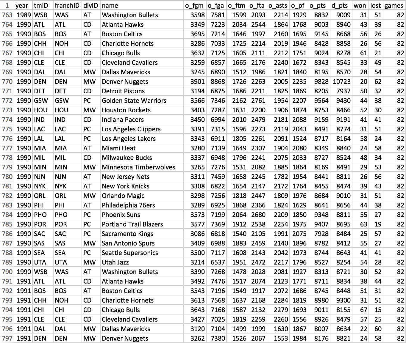
Not all columns shown here in the cleaned version of the dataset were used, though they do provide context for further investigation.
Analysis
My analysis of the NBA team dataset using regression models is rooted in the fundamental principles of statistical learning. Regression, at its core, is about establishing a relationship between a dependent variable and one or more independent variables. The objective is to predict the dependent variable based on the values of the independent variables. In this context, I aimed to predict a team’s win-loss percentage (dependent variable) from selected features (independent variables) such as field goal percentage, offensive points, assists, defensive points, and free throws made.
The process began by loading the dataset and calculating two critical metrics: field goal percentage and win-loss percentage. Field goal percentage (fg_percentage) is calculated as the ratio of field goals made (o_fgm) to field goals attempted (o_fga), and the win-loss percentage is the ratio of games won to total games played. These calculations are essential as they convert raw data into meaningful metrics that can be analyzed.
In my analysis of NBA team data, I used two types of statistical models: linear regression and Ridge regression. Let us break down these concepts for clarity:
Linear Regression:
This is a basic form of regression analysis, which is a statistical method used to understand relationships between variables. Imagine it as finding the best straight line to fit a scatter plot of data points. In linear regression, the fundamental theory is that this best line represents the predicted relationship between an independent variable (i.e. feature, like total points scored) and a dependent variable (something you want to predict, i.e. win-loss percentage). Each feature received its own linear regression model in this part of the analysis. To evaluate how well these models work, we use two metrics:
R-squared:
This(9) tells us how much of the variation in our dependent variable (win-loss percentage) can be explained by the independent variable (like total points scored). An R-squared value closer to 1 means the model explains much of the variation in our data, which is a sign that we have produced a useful model.
Mean Squared Error (MSE):
This(6) measures the average of the squares of the errors, that is, the average squared difference between the actual values and the values predicted by the model. A lower MSE means the model is more accurate.
Ridge Regression:
In my analysis of NBA statistics, I chose Ridge regression, an advanced variant of linear regression, to tackle a specific issue known as multicollinearity. Multicollinearity in this context refers to a situation where the independent variables (the features I am using for prediction) are highly correlated with each other. For example, in basketball, aspects such as field goal percentage and total points scored are likely to be correlated since a higher field goal percentage generally leads to more points. This correlation between variables can cause problems in standard linear regression models, as it makes it difficult to determine the individual effect of each feature on the dependent variable, which in this case is the team’s win-loss percentage.
The theory behind Ridge regression involves modifying linear regression by introducing a penalty on the size of the coefficients. Here, coefficients are numerical values that represent the strength and direction of the relationship between each independent variable and the dependent variable. However, in Ridge regression, there is an additional component in the calculation that penalizes large coefficients, which prevents any single feature from having a disproportionately large influence on the predictions. This approach is particularly effective in addressing the challenges posed by multicollinearity. The penalty term’s strength is determined by a parameter known as alpha. The higher the value of alpha, the greater the penalty imposed on large coefficients, which in turn reduces the risk of overfitting. Overfitting occurs when a model is too closely fitted to the specific details of the training data, making it perform poorly on new data.
In my implementation of the Ridge regression model for the NBA dataset, I used a “pipeline”(10)(12) approach. The first step in this pipeline was standardization(11), a process that adjusts the values of each feature in the dataset to have a mean of zero and a standard deviation of one. Standardization is critical because it ensures that all features contribute equally to the prediction and no single feature with large values overpowers the model. This step is especially important for Ridge regression, as the penalty applied to the coefficients is effective only when all features are on a comparable scale. This approach allowed me to accurately assess the impact of each basketball statistic on a team’s win-loss percentage, despite the potential correlations among these features.
Let us examine my code step-by-step. In the spirit of reiterating these important concepts, we will delve deeper within their respective contexts:
The instructions provided here are primarily tailored for JupyterLab within the Anaconda Navigator environment. However, the principles and steps can be easily adapted to other environments where Jupyter notebooks are used.
1) Installations
Ensure that you have the necessary Python libraries installed on your machine. You can disregard or comment out this line of code if they are already installed.
#install the necessary libraries on your machine
!pip install pandas numpy matplotlib scikit-learn
2) CSV Import and Feature Definitions
We delve into the practical application of data science techniques using our NBA dataset loaded from a CSV file. Our first step involves importing the necessary Python libraries that provide tools for data manipulation, statistical modeling, and visualization.
We use pandas for data handling, NumPy for numerical operations, Matplotlib for plotting graphs, and scikit-learn for our regression models. After loading the data, we calculate crucial basketball statistics like field goal percentage and win-loss percentage, providing us with insightful metrics for our analysis. As we alluded to earlier, these calculations are not just mere arithmetic; they transform raw data into meaningful information that reflects team performance.
To ensure the quality and reliability of our analysis, we also address data cleaning by removing infinite or NaN (Not a Number) values, as I mentioned above in the Munging, Wrangling, and Cleaning Data section. This step is crucial for ensuring the integrity and reliability of the analysis, as regression models require numerical input and cannot interpret NaN values.
Additionally, we define a set of features for regression analysis. These features, such as total points scored and total assists, are used to predict the win-loss percentage of teams, our target (dependent) variable. By assigning descriptive titles to these features, we make our plots more understandable, laying a strong foundation for the regression analysis that follows.
#import the necessary libraries
import pandas as pd
import numpy as np
import matplotlib.pyplot as plt
from sklearn.linear_model import LinearRegression, RidgeCV
from sklearn.preprocessing import StandardScaler
from sklearn.pipeline import Pipeline
from sklearn.metrics import r2_score, mean_squared_error

#read the CSV file containing the NBA data into a pandas DataFrame
data = pd.read_csv('basketball_teams_cleaned.csv')

#calculate the field goal percentage as field goals made divided by field goals attempted
data['fg_percentage'] = data['o_fgm'] / data['o_fga']

#calculate the win-loss percentage as the number of games won divided by total games
data['win_loss_percentage'] = data['won'] / data['games']

#replace infinite values with NaN, and then drop rows with NaN values
data.replace([np.inf, -np.inf], np.nan, inplace=True)
data.dropna(inplace=True)

#define a list of feature names for the regression analysis
features = ['fg_percentage', 'o_pts', 'o_asts', 'd_pts', 'o_ftm']

#assign the win-loss percentage column as the target variable for the regression
y = data['win_loss_percentage']

#map feature names to more descriptive titles for plotting
feature_names = {

    'fg_percentage': 'Field Goal Percentage',
    'o_pts': 'Total Points Scored',
    'o_asts': 'Total Assists',
    'd_pts': 'Total Points Allowed',
    'o_ftm': 'Total Free Throws Made'

}
3) Regression Models by Feature
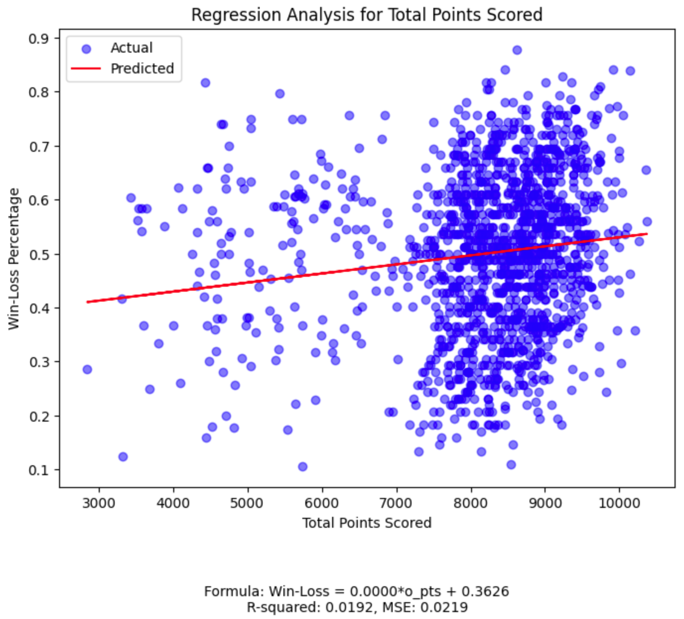
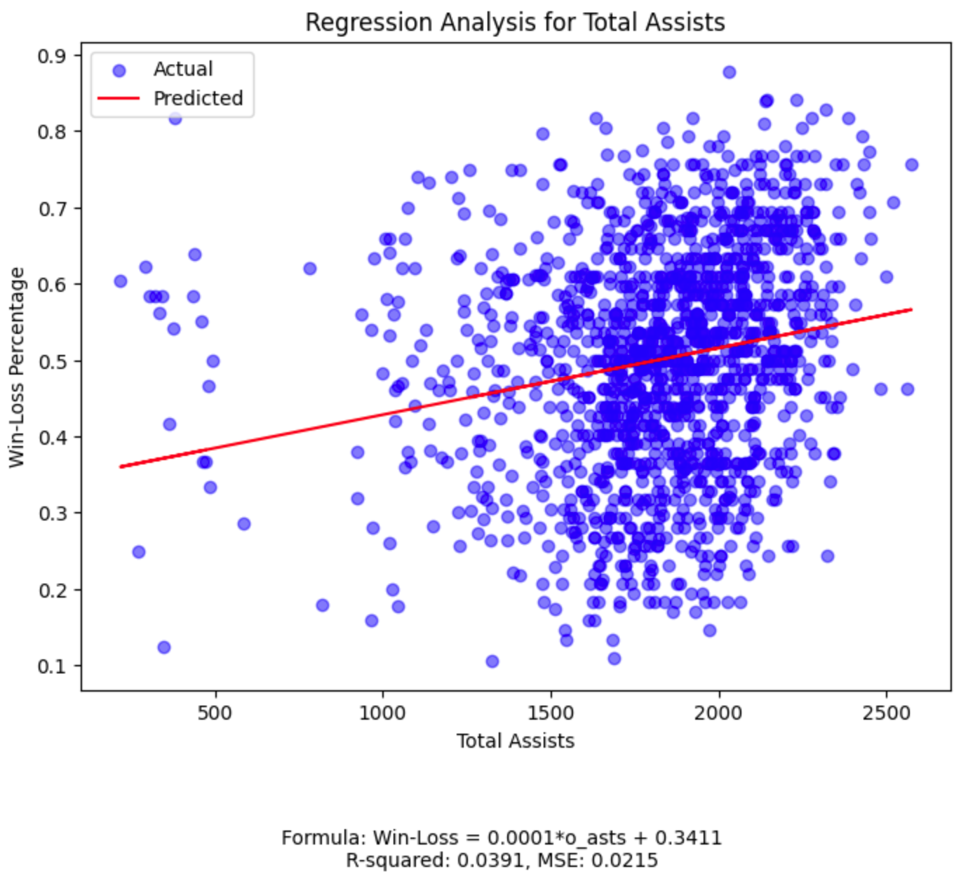
We take a closer look at each individual feature in our dataset and examine its relationship with the team’s win-loss percentage. To do this, we employ linear regression, a fundamental statistical technique that allows us to understand and quantify the relationship between a single independent variable (our feature) and a dependent variable (the win-loss percentage).
For each feature, we create a separate plot. These plots show the actual data points for each team and include a regression line. This line is the result of our linear regression model, representing the best fit through the data points, thereby illustrating the trend or relationship between the feature and the win-loss percentage.
By fitting a linear regression model to each feature, we also extract valuable statistics like the coefficient (indicating the rate of change of win-loss percentage with respect to the feature) and the intercept (the expected win-loss percentage when the feature value is zero). We also compute the R-squared value, which tells us how well the model explains the variation in win-loss percentage, and the Mean Squared Error, giving us a sense of the average prediction error.
Each plot displays these insights, making it easier to understand the impact of each individual basketball statistic on a team’s overall performance. This approach provides a clear, visual representation of the data, aiding in our understanding of the complex dynamics of basketball team performance.
#loop through each feature in the 'features' list to create individual regression plots
for feature in features:

    #create a new figure and axis for each plot with specified size
    # 'fig' refers to the entire figure, 'ax' refers to the specific axes object in the figure
    #setting the size to 8x6 inches for better visibility of the plot
    fig, ax = plt.subplots(figsize=(8, 6))

    #select the data for the current feature as the independent variable (X)
    #this step isolates the data for one specific feature to analyze its relationship with the target variable
    X_feature = data[[feature]]

    #initialize a linear regression model
    #LinearRegression() is a method from scikit-learn to perform linear regression
    lin_model = LinearRegression()

    #fit the linear regression model to the data
    #this process involves finding the best line that fits the data points for the current feature
    #the model learns the relationship between the feature (X_feature) and the target (y)
    lin_model.fit(X_feature, y)

    #make predictions using the fitted model
    #the model predicts the target variable (win-loss percentage) based on the feature data
    y_pred = lin_model.predict(X_feature)

    #extract the coefficient (slope) and intercept from the fitted model
    #the coefficient represents the change in the target variable for a one-unit change in the feature
    #the intercept is the value of the target variable when the feature is zero
    coefficient = lin_model.coef_[0]
    intercept = lin_model.intercept_

    #construct the linear regression formula as a string for display
    #this string represents the equation of the line fitted by the linear regression model
    formula = f'Win-Loss = {coefficient:.4f}*{feature} + {intercept:.4f}'

    #calculate the R-squared value for the model
    #R-squared is a statistical measure that represents the proportion of the variance in the dependent variable
    #that is predictable from the independent variable(s)
    #it represents how close the data are to the fitted regression line and is also known as the coefficient of determination
    #this metric provides an indication of the goodness of fit of the model
    #a higher R-squared value means the model explains more variability in the target variable relative to its mean
    #it provides an indication of how well the model explains the variation in the target variable
    r2 = r2_score(y, y_pred)

    #calculate the Mean Squared Error for the model
    #MSE is a measure of the average of the squares of the errors
    #the 'error' here is the difference between the actual and predicted values
    #MSE is a common measure of the accuracy of a regression model
    #a lower MSE indicates a closer fit of the model to the data
    mse = mean_squared_error(y, y_pred)

    #plot the actual data points on the plot
    #scatter plot is used to visualize the individual data points
    ax.scatter(X_feature, y, color='blue', alpha=0.5, label='Actual')

    #plot the regression line based on the model's predictions
    #the 'ax.plot' function is used to draw the line on the plot
    #'X_feature' represents the values of the current feature being analyzed
    #'y_pred' contains the predicted values of the target variable (win-loss percentage) by the linear regression model
    #these predictions are based on the learned relationship between 'X_feature' and 'y'
    #the line drawn represents the 'best fit' line through the data points
    #a 'best fit' line is the one where the total sum of the squares of the vertical distances of the points
    #from the line is minimized
    #this line visually demonstrates the trend or relationship as determined by the linear regression model
    #the closer the data points are to this line, the better the model is at predicting the target variable
    ax.plot(X_feature, y_pred, color='red', label='Predicted')

    #set the title, labels, and legend for the plot
    ax.set_title(f'Regression Analysis for {feature_names[feature]}')
    ax.set_xlabel(feature_names[feature])
    ax.set_ylabel('Win-Loss Percentage')
    ax.legend()

    #add the regression formula, R-squared value, and MSE value as a caption below the plot
    #this additional information provides insight into the model's equation and how well it fits
    plt.figtext(0.5, -0.1, f'Formula: {formula}\nR-squared: {r2:.4f}, MSE: {mse:.4f}', ha='center', fontsize=10)

    #display the plot
    #this command renders the plot and displays it to the user
    plt.show()
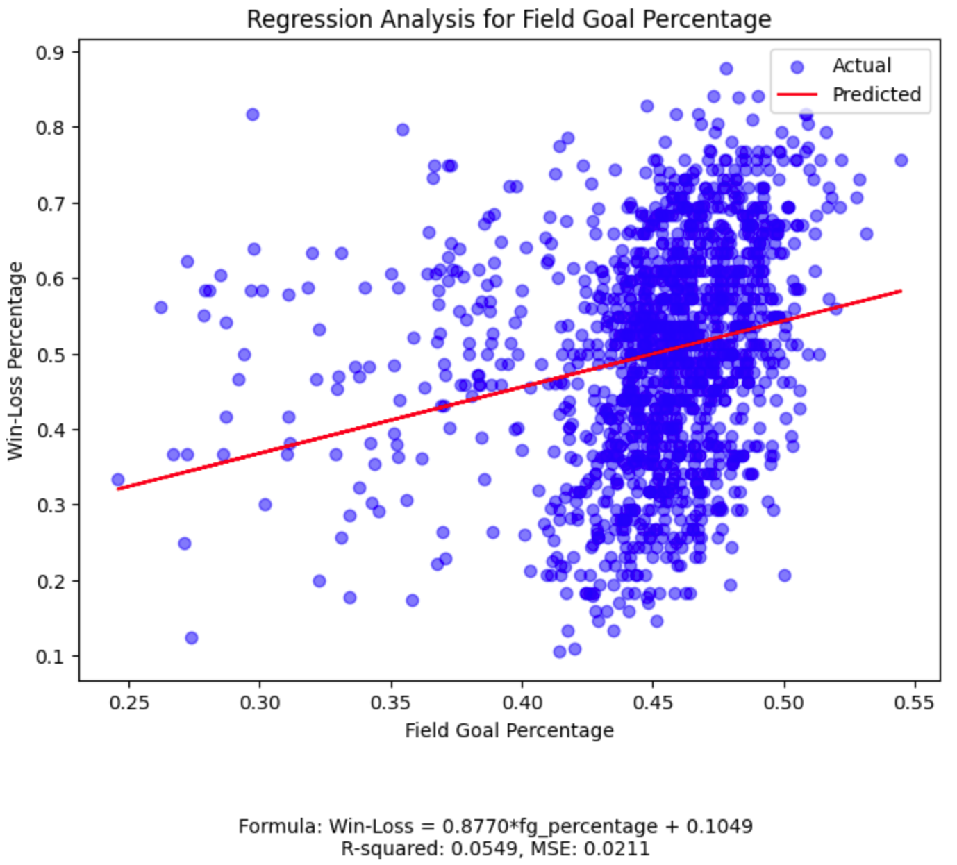
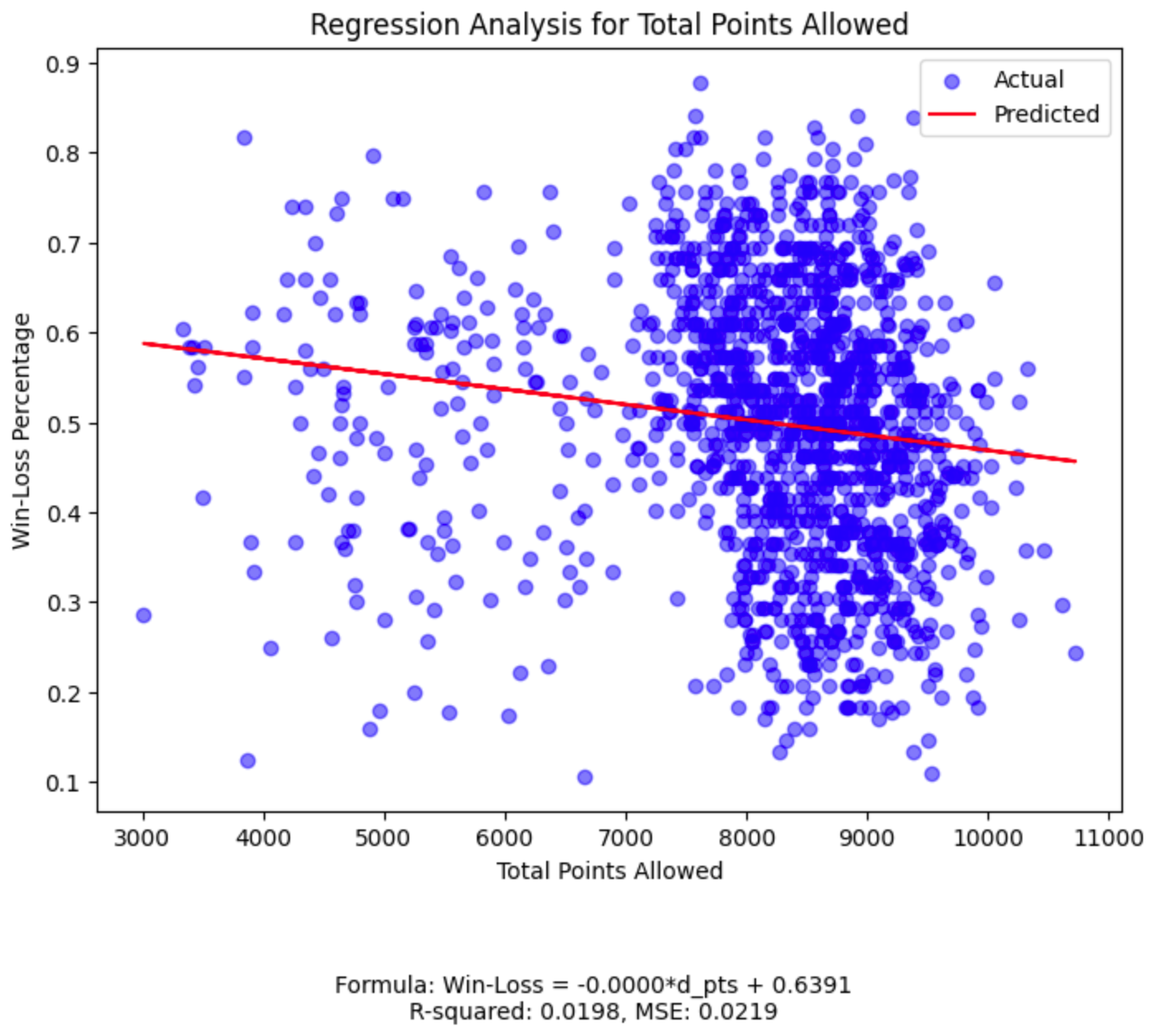
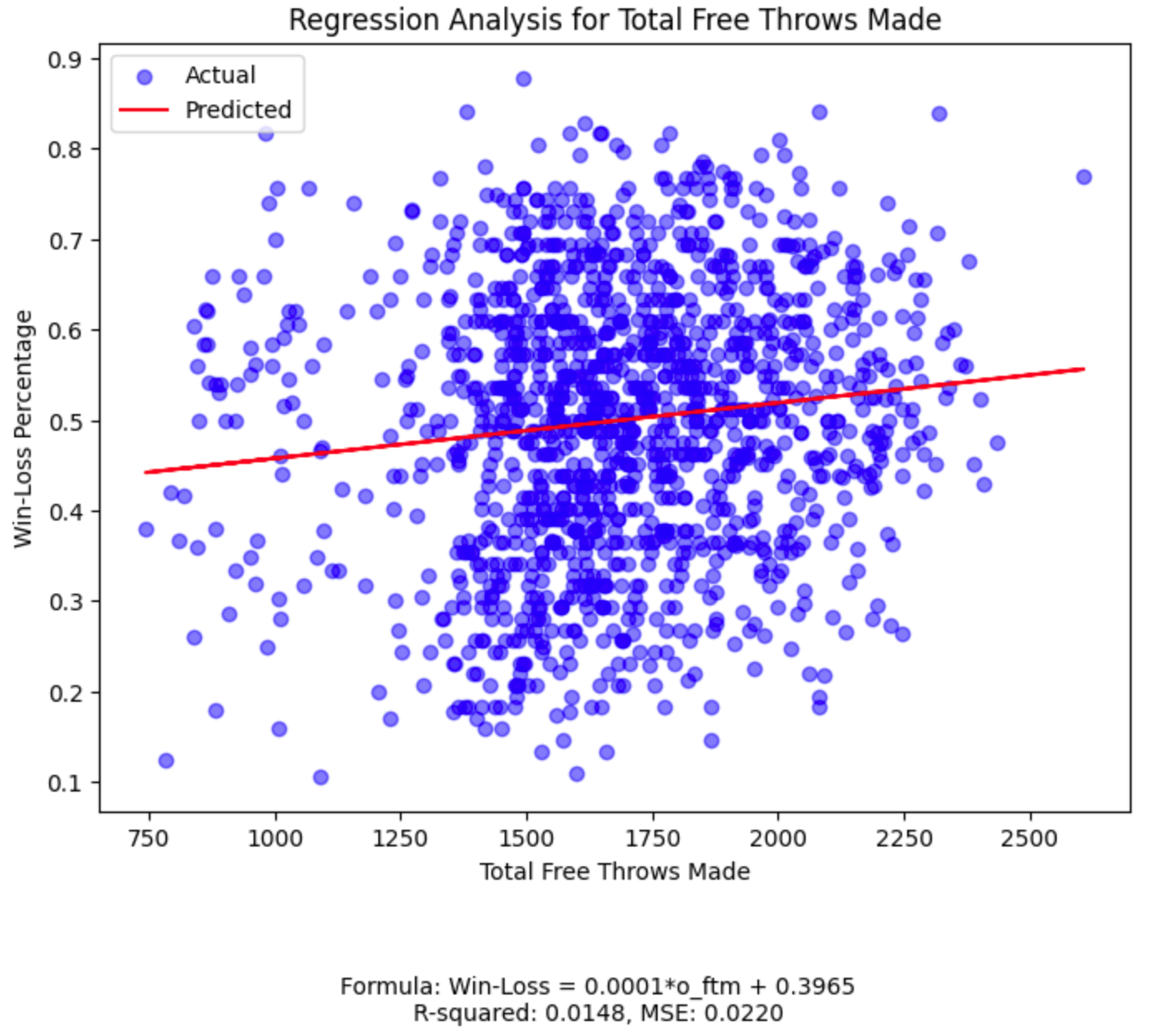
While our field goal percentage plot has the highest R-squared among the five features, its value of 0.0549
(much closer to 0 than 1) tells us we should continue our search for a more powerful predictive relationship.
4) Original Ridge Regression
We delve into the application of Ridge regression, a robust form of linear regression, to our NBA dataset. The process begins by preparing the feature data for the regression analysis. The feature data, referred to as independent variables, are consolidated into a single dataset, designated ‘X’. This dataset is then processed through a pipeline that serves two primary functions: standardization and regression.
Standardization, implemented through the StandardScaler, ensures that each feature has a mean of zero and a standard deviation of one, making them comparable despite differing scales. This step is crucial for features that differ significantly in their units of measurement, such as points scored and assists.
Following standardization, Ridge regression is applied. Ridge regression is an advanced form of linear regression that includes a regularization term. As we discussed above, this term penalizes large coefficients, which helps in preventing overfitting — a scenario where a model performs well on the training data but poorly on new, unseen data. The Ridge regression model is fitted to the standardized data, and the optimal coefficients and alpha value — a parameter controlling the strength of the penalty — are determined.
Once the model is trained, it is used to make predictions on the dataset. The predicted win-loss percentages are computed and compared against the actual values. Additionally, the coefficients and intercept from the Ridge model are extracted, providing insight into the relationships between each feature and the target variable. The resulting linear equation of the Ridge model is formulated, and its effectiveness is evaluated using the R-squared value and Mean Squared Error (MSE). These metrics assess the model’s accuracy and the degree to which it captures the variation in win-loss percentage.
A scatter plot is then generated to visually represent the model’s predictions alongside the actual data points. The plot includes the regression line, illustrating the model’s predictive trend, and is annotated with the model’s formula, R-squared value, and MSE for a comprehensive analysis.
#prepare the feature data (independent variables) for Ridge Regression
#this step consolidates the selected features into a single DataFrame
#'X' will be used as the input for the Ridge regression model
X = data[features]

#set up a pipeline for Ridge regression, which includes standardization and the regression itself
#the pipeline in scikit-learn is a sequence of data processing steps combined into one
ridge_pipeline = Pipeline([

    #the first element in the pipeline is 'scaler', which uses StandardScaler()
    #StandardScaler is used for standardizing the dataset, a common requirement for many machine learning estimators
    #it transforms each feature (independent variable) to have zero mean and unit variance
    #this is important because features might be measured in different units, and we want to ensure comparability
    #for example, points scored (o_pts) and assists (o_asts) are on different scales and need standardizing
    ('scaler', StandardScaler()),

    #the second element is 'ridgecv', which uses RidgeCV for the Ridge regression
    #RidgeCV applies Ridge regression with built-in cross-validation of the alpha parameter
    #cross-validation is a technique to evaluate how effectively the model performs on unseen data
    #Ridge regression is a type of linear regression that includes a regularization term
    #the regularization term (alpha) penalizes large coefficients in the regression model
    #this helps to prevent overfitting, where a model performs well on training data but poorly on new, unseen data
    #the 'alphas' parameter here is a range of alpha values for which the cross-validation is performed
    #the range goes from 10^-6 to 10^6, logarithmically spaced, allowing the model to explore a wide range of regularization strengths
    ('ridgecv', RidgeCV(alphas=np.logspace(-6, 6, 13)))

])

#fit the Ridge regression model to the data
#the 'fit' method is called on the pipeline object
#it first applies the standard scaler to the feature data (X), normalizing each feature
#it then fits the Ridge regression model to this standardized data
#the 'X' variable contains the feature data (like field goal percentage, total points scored, etc.)
#the 'y' variable is the target variable, which is the win-loss percentage of NBA teams
#this step trains the Ridge regression model, determining the best coefficients for each feature and the optimal alpha value
#the model is now ready to make predictions or be evaluated for its performance
ridge_pipeline.fit(X, y)

#use the fitted model to make predictions on the dataset
#the 'predict' method applies the trained Ridge regression model to the feature data 'X'
#it outputs the predicted target variable values based on the learned relationships in the model
#in this case, 'y_pred_ridge' will hold the win-loss percentage predictions made by the Ridge model
y_pred_ridge = ridge_pipeline.predict(X)

#extract the coefficients and intercept from the Ridge model
#the coefficients represent the relationship between each feature and the target variable
#in Ridge regression, these coefficients are optimized not only to fit the data but also to be as small as possible
#this is done to improve the model's generalizability and prevent overfitting
#'ridge_coefficients' holds these optimized coefficient values for each feature
ridge_coefficients = ridge_pipeline.named_steps['ridgecv'].coef_

#the intercept is a constant term in the regression equation
#it represents the expected mean value of the target variable when all the feature values are set to zero
#'ridge_intercept' holds the value of this intercept
ridge_intercept = ridge_pipeline.named_steps['ridgecv'].intercept_

#construct the Ridge regression formula as a string
#the formula represents the linear equation used by the Ridge regression model
#each term in the formula is a product of a feature's coefficient and the feature itself
#the 'join' function concatenates these terms into a single string, with each term separated by ' + '
#this provides a clear and concise representation of how each feature contributes to the predicted value
ridge_formula = ' + '.join([f'{coef:.4f}*{feat}' for coef, feat in zip(ridge_coefficients, features)])

#the final formula includes the intercept term, added at the end
#this complete formula can be used to manually compute predictions for given feature values
ridge_formula_full = f'Win-Loss = {ridge_formula} + {ridge_intercept:.4f}'

#calculate the R-squared value for the Ridge model
#'r2_ridge' will hold this R-squared value, indicating the proportion of variance in the win-loss percentage
#that is predictable from the features
r2_ridge = r2_score(y, y_pred_ridge)

#calculate the Mean Squared Error (MSE) for the Ridge model
mse_ridge = mean_squared_error(y, y_pred_ridge)

#plot the scatterplot for the original Ridge Regression model
fig, ax = plt.subplots(figsize=(8, 6))

#plot the actual data points
ax.scatter(y, y_pred_ridge, color='blue', alpha=0.5, label='Actual')

#plot the regression line based on the model's predictions
ax.plot([min(y), max(y)], [min(y_pred_ridge), max(y_pred_ridge)], color='red', label='Predicted')

#set the title, labels, and legend for the plot
ax.set_title('Original Ridge Regression Analysis')
ax.set_xlabel('Actual Win-Loss Percentage')
ax.set_ylabel('Predicted Win-Loss Percentage')
ax.legend()

#add the regression formula, R-squared, and MSE value as a caption below the plot
plt.figtext(0.5, -0.1, f'Formula: {ridge_formula_full}\nR-squared: {r2_ridge:.4f}, MSE: {mse_ridge:.4f}', ha='center', fontsize=10)

#display the plot
plt.show()
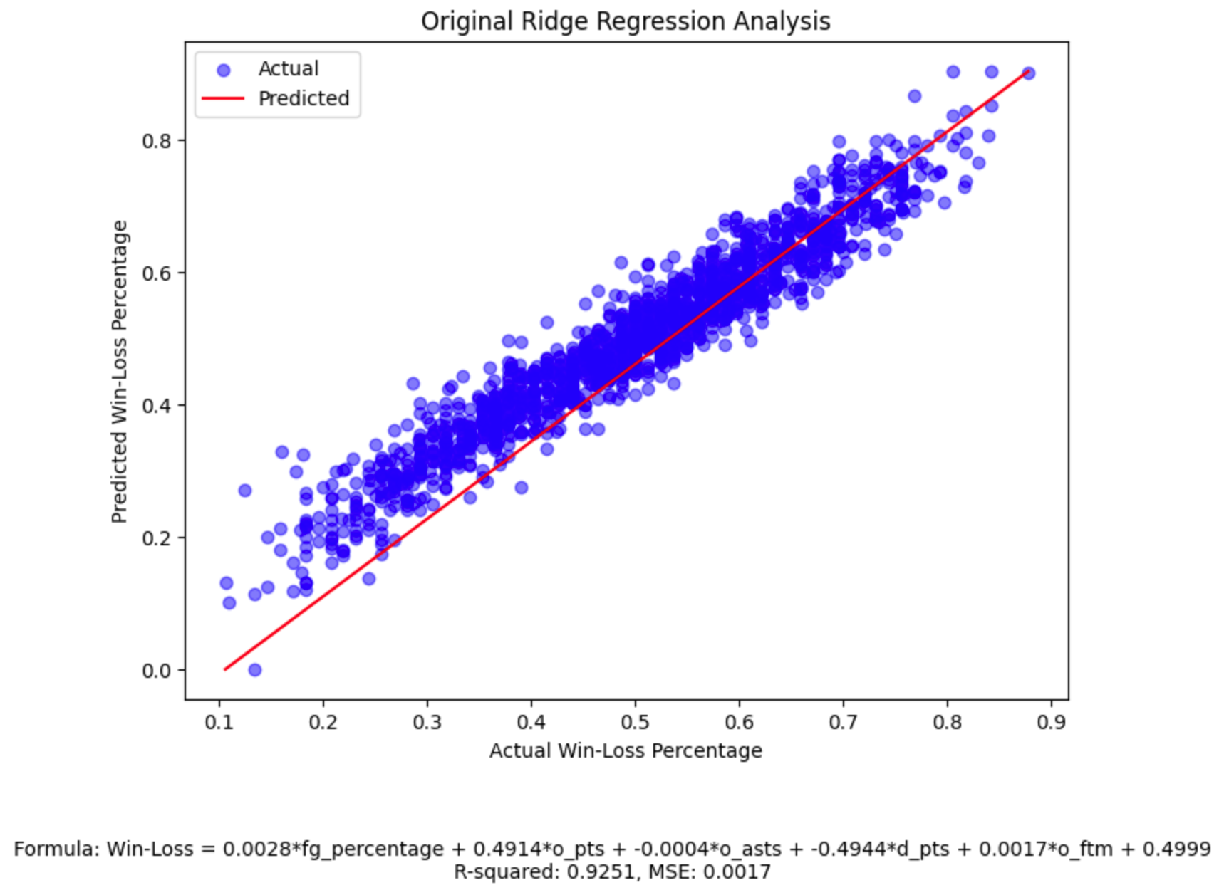
Notice the high R-squared and low MSE, which tell us our model has high predictive power.
5) Improved (Post-Threshold) Ridge Regression
We enhance the predictive accuracy of our Ridge regression model by refining the selection of features based upon their significance. This process commences by establishing a threshold, which in this case is set at 0.01. The threshold of 0.01 strikes a balance between model simplicity and predictive power; it is high enough to exclude features with negligible influence but low enough to retain those that contribute meaningfully to the prediction of win-loss percentage. This threshold serves as a criterion to identify features that have a substantial impact on the win-loss percentage. We retain for further analysis features with coefficients (parameters indicating the influence of each feature on the target variable) having an absolute value equal to or greater than the threshold.
Once the significant features are identified, the data corresponding to these features is prepared for a new round of Ridge regression. This step involves creating a subset of the original dataset, focusing solely on the features that met the threshold criteria.
A fresh Ridge regression pipeline is then established for these selected features. Similar to the initial model, this pipeline incorporates feature standardization and Ridge regression with cross-validation. Standardization ensures that all features contribute equally to the model, while cross-validation aids in selecting the optimal alpha value, balancing model complexity and prediction accuracy.
The newly configured model is fitted to the selected features, adapting its coefficients and intercept to this refined dataset. This adaptation aims to enhance the model’s predictive power by focusing on the most influential aspects of the data.
After fitting the model, it is employed to make predictions on the dataset comprising the selected features. These predictions are then assessed for accuracy using the R-squared value and the Mean Squared Error (MSE). As we have discussed above, R-squared quantifies how much of the variation in the win-loss percentage is explained by the model, while MSE measures the average squared difference between the actual and predicted values.
The final step involves visualizing the performance of this improved model. A scatter plot is generated, depicting the actual data points and the regression line derived from the model’s predictions. The plot is annotated with the model’s formula, R-squared value, and MSE, providing a comprehensive overview of its performance. This visual representation allows for an intuitive understanding of how well the new model fits the data, compared to the original model, and the degree of improvement achieved through feature selection.
#determine the threshold for identifying significant features
threshold = 0.01

#select features where the absolute value of the coefficient is greater than or equal to the threshold
features_to_keep = [feat for coef, feat in zip(ridge_coefficients, features) if abs(coef) >= threshold]

#prepare the data with the selected significant features
X_selected = data[features_to_keep]

#set up a new Ridge regression pipeline for the selected features
ridge_pipeline_selected = Pipeline([

    #as above, we use StandardScaler to standardize features by removing the mean and scaling to unit variance
    #each feature will have a mean value of 0 and a standard deviation of 1, ensuring all features are on the same scale
    ('scaler', StandardScaler()),

    #as above, we use RidgeCV for Ridge regression with built-in cross-validation of the alpha parameter
    ('ridgecv', RidgeCV(alphas=np.logspace(-6, 6, 13)))

])

#fit the new Ridge model to the selected features
#the 'X_selected' variable contains the data for the features that passed the threshold criteria
#'y' is the target variable, which is the win-loss percentage of NBA teams
ridge_pipeline_selected.fit(X_selected, y)

#use the fitted model to make predictions on the selected features dataset
#'y_pred_ridge_selected' will store these predicted values
y_pred_ridge_selected = ridge_pipeline_selected.predict(X_selected)

#calculate the R-squared value for the new Ridge model
r2_ridge_selected = r2_score(y, y_pred_ridge_selected)

#calculate the Mean Squared Error (MSE) for the new model
mse_ridge_selected = mean_squared_error(y, y_pred_ridge_selected)

#extract the coefficients and intercept from the new Ridge model
ridge_coefficients_selected = ridge_pipeline_selected.named_steps['ridgecv'].coef_
ridge_intercept_selected = ridge_pipeline_selected.named_steps['ridgecv'].intercept_

#construct the formula for the new Ridge model using the extracted parameters
#this formula represents the linear equation that the model uses to make predictions
#each feature's contribution is shown with its corresponding coefficient
ridge_formula_selected = ' + '.join([f'{coef:.4f}*{feat}' for coef, feat in zip(ridge_coefficients_selected, features_to_keep)])
ridge_formula_selected_full = f'Win-Loss = {ridge_formula_selected} + {ridge_intercept_selected:.4f}'

#plot the scatterplot for the new Ridge Regression model
fig, ax = plt.subplots(figsize=(8, 6))

#plot the actual data points
ax.scatter(y, y_pred_ridge_selected, color='blue', alpha=0.5, label='Actual')

#plot the regression line based on the model's predictions
ax.plot([min(y), max(y)], [min(y_pred_ridge_selected), max(y_pred_ridge_selected)], color='red', label='Predicted')

#set the title, labels, and legend for the plot
ax.set_title('Improved (Post-Threshold) Ridge Regression Analysis')
ax.set_xlabel('Actual Win-Loss Percentage')
ax.set_ylabel('Predicted Win-Loss Percentage')
ax.legend()

#add the regression formula, R-squared, and Mean Squared Error values as a caption below the plot
plt.figtext(0.5, -0.1, f'Formula (Improved): {ridge_formula_selected_full}\nR-squared: {r2_ridge_selected:.4f}, MSE: {mse_ridge_selected:.4f}', ha='center', fontsize=10)

#display the plot
plt.show()
-ridge-regression-analysis.png)
The “magic” of data science in action!
On the surface, this plot appears to be very similar to our original Ridge regression plot. However, because we implemented our threshold to remove variables with minimal impact, we see improvement both in simplicity and comprehensibility. This ultimately makes our model more versatile and robust, where less computational resources are needed to draw our conclusions.
Conclusion & Key Takeaways
These statistical techniques, linear and Ridge regression, allow us to establish and evaluate relationships between different basketball statistics and team performance, providing valuable insights into what contributes to winning in professional basketball.
In the NBA dataset analysis, the use of a threshold in refining the Ridge regression model is a key element. The threshold is essentially a predetermined value used to evaluate the importance of each feature in the model. It is based on the size of the feature’s coefficient in the Ridge regression model. As we have learned, coefficients in regression are numbers that signify the strength and direction of the relationship between each feature and the dependent variable. In this analysis, if a feature’s coefficient is below the threshold (in absolute terms), it is deemed to have a minimal impact on predicting the team’s win-loss percentage and is thus excluded from the refined model to simplify it and potentially increase its predictive accuracy.
In the initial Ridge regression model, the coefficients for our features were as follows:
- fg_percentage: 0.0028
- o_pts: 0.4914
- o_asts: -0.0004
- d_pts: -0.4944
- o_ftm: 0.0017
The comprehensive analysis used in our initial Ridge regression model, which accounts for all of these features, yielded a high R-squared value of 0.9251 and a low MSE of 0.0017. This indicates that the model can explain about 92.51% of the variance in the win-loss percentage – a substantial improvement compared to the individual linear regression models for each feature. For instance, the linear regression model for fg_percentage alone had an R-squared of only 0.0549, signifying its limited predictive power when used in isolation.
By setting a threshold of 0.01 in our improved model, I determined that o_pts (0.4914) and d_pts (-0.4944) significantly impact the win-loss percentage as their coefficients are notably higher than the threshold. In contrast, fg_percentage, o_asts, and o_ftm, with much smaller coefficients, are considered less impactful.
Refining the Ridge model by applying the threshold led to a slight decrease in the R-squared value to 0.9250. This minor change suggests that the features excluded based on the threshold, while having smaller coefficients, still contributed very slightly to the overall predictive power of the model. However, the improved model, with its formula
Win-Loss = 0.4956 * o_pts - 0.4957 * d_pts + 0.4999
continues to be highly effective. Importantly, a simpler equation with fewer variables enhances interpretability and practical applicability, making it easier for analysts and decision-makers to understand and utilize the model’s insights in strategic planning and performance analysis. This formula highlights the significance of offensive points (o_pts) and defensive points (d_pts) as key predictors of a team’s success.
Additionally, you can see that these two coefficient values updated slightly after the removal of the features that did not meet the threshold. The positive coefficient for o_pts (0.4956) implies that teams scoring more points generally have a better win-loss record. Conversely, the negative coefficient for d_pts (-0.4957) suggests that teams allowing less points are likely to have a better win-loss record. These insights resonate well with the fundamental principles of basketball, where the goal is to score more points than the opponent while limiting their scoring.
In conclusion, the application of the Ridge regression model in this NBA data analysis beautifully illustrates the ‘magic’ of data science. This model effectively navigates the complexities of multicollinearity and feature selection, which are common challenges in data-rich environments like professional sports. By resolving these issues, the model provides a nuanced and detailed understanding of what influences a basketball team’s performance. More than just confirming what basketball enthusiasts might intuitively know about offensive efficiency and defensive capability, it quantifies their impact in a precise manner. This quantification is a powerful aspect of data science – turning abstract concepts into measurable, actionable insights.
The magic here lies in transforming raw, often overwhelming data into clear, evidence-based narratives. Data science, in this context, goes beyond mere statistics; it tells a story about team dynamics, player performance, and game strategies. It allows us to peek behind the curtain and understand the mechanics of winning in professional basketball. The insights gained from this analysis could be pivotal for coaches, players, and team management, offering a data-driven roadmap to optimize performance and develop new strategies, tailored to the important features of points scored and points allowed.
Our example of Ridge regression in NBA analytics is a testament to the broader capabilities of data science. It demonstrates how sophisticated analytical tools can harness vast amounts of data to uncover deeper truths in sports, as well as any other field where data is crucial. This is the essence of the magic of data science: using rigorous methods to extract meaning from data, thus enabling better decisions, innovations, and understanding.
Sources
Dataset Source
Research Sources (Learn More!)
- How to Develop Ridge Regression Models in Python - Machine Learning Mastery
- Introduction to Ridge Regression - Statology
- Linear Regression in Scikit-Learn (sklearn): An Introduction - datagy
- Ridge Regression in Python - AskPython
- Ridge Regression: Regulating overfitting when using many features - Stanford CS229
- scikit-learn Documentation: Mean Squared Error
- scikit-learn Documentation: Linear Regression
- scikit-learn Documentation: Ridge Regression
- scikit-learn Documentation: R² Score
- scikit-learn Documentation: Pipeline
- scikit-learn Documentation: Preprocessing Data
- What is a Scikit-learn Pipeline? - Python Simplified
- Web-scraping, Web-crawling, and APIs Guidebook - University of Michigan