
Can we discover insight among various chronic disease indicators in the U.S. from 2001 to 2021?
Table of Contents
- Introduction
- Dataset
- Initial Questions
- Discoveries and Insights
- Follow-Up Questions
- Conclusion
- Sources
Introduction
By using R to create regression analyses of the CDC’s U.S. Chronic Disease Indicators vast dataset (2001-2021), I will demonstrate interesting relationships between associated variables.
Among these 124 chronic indicators are a variety of compelling “questions”; in my examination of these indicators, I aim to draw upon my pre-existing health knowledge to see if I could find interesting associations between different indicators. My goal in this data exploration was to uncover statistical validation for some of my correlation hypotheses. In the below “Discoveries and Insights” and “Follow-Up Questions” sections, we will examine R values to determine degree of correlation, R² values to determine how well one variable predicts another, and p-values to determine the strength of the relationship.
Consistent low p-values (defined as less than 0.05) across my selected regressions tell us that the various variables are related, though we will see how low R and R² values mean that they are not strong predictors of each other. Essentially, this is the most interesting insight from this project: that health data is complex and determined by many interrelated variables, where no two variables in isolation can effectively predict one another.
Additionally, for my follow-up questions, where I create combined variables to attempt to emulate multiple health-related variables impacting in conjunction another health variable, continues to demonstrate low correlations. Though the correlations are slightly higher, they are still not high enough to demonstrate predictive power; this continues to speak to the main insight from this study, where health outcomes are incredibly complex to predict.
The relevant relationships demonstrated through my statistical analysis should not overshadow the important understanding that multitudinous variables are involved in determining health outcomes. Our key takeaway is that it is very difficult to demonstrate strong correlations between two (or three, as we will see in the follow-up questions) health indicators.
Dataset
The Division of Population Health within the Centers for Disease Control and Prevention (CDC) provides this publicly available dataset of U.S. Chronic Disease Indicators, with data ranging from 2001 to 2021. Within this “cross-cutting set” are 124 disease indicators, which allow for uniformity across different states and territories in terms of specific definitions and collection/reporting processes. The CDC falls under the U.S. Department of Health & Human Services.
This dataset contains 1,185,676 entries; therefore, R was well-suited for the task given its ability to handle large datasets smoothly (Excel would be unusable given its limit of 1,048,576 rows). In terms of wrangling/cleaning the data, I was fortunate that the dataset well-maintained. Given this, safeguard functions within R to ignore cells with NA (empty) values were able to do most of the heavy lifting for my data wrangling process. I elaborate upon the data wrangling process in more detail within the Initial Questions below.
Additionally, I made the decision to remove outliers below the 1st percentile and above the 99th percentile within the variables constituting heart failure mortality and liver disease mortality. These outliers highly skewed the data and prevented me from telling an insightful story.
A visual examination of the dataset shows some columns lacking consistency in the thoroughness of their content; however, these were irrelevant for the purposes of my analysis given that I focused on mainly three columns of data: the Question column (represeting one of the 124 disease indicators), the DataValue column (representing the corresponding data value for its associated Question), and the LocationAbbr (state/territory) column.
Initial Questions
The intentions of my analysis are rooted in better understanding confounding factors within public health by examining a publicly available U.S. government dataset on chronic disease indicators from 2001 to 2021. As my parents age and deal with their own personal health problems, I find myself more interested than ever to see what lifestyle adjustments they could potentially make in order to achieve the best possible health outcomes. In this way, this analysis includes a rather personal component, giving me added curiosity and incentive to discover insight.
This data exploration initially examines the following 6 questions by using 13 total regression visualizations and their associated statistical metrics. I follow these initial questions with 3 additional questions that address my initial findings (discussed below in the “Follow-Up Questions” section).
- Obesity and Cholesterol: Is there a statistically significant relationship between obesity and cholesterol levels among adults?
- Alcohol Consumption and Mortality: How does alcohol consumption correlate with heart failure and liver disease mortality rates?
- Youth Tobacco Use: What is the relationship between youth tobacco use (smokeless tobacco and cigarette smoking) and alcohol consumption?
- PE Participation and Obesity: Can a significant relationship be established between participation in physical education (PE) and obesity rates among high school students?
- Fluoridation and Tooth Loss: Does community water fluoridation have a measurable impact on the prevalence of tooth loss among adults?
- Farmers Markets and Healthy Consumption: Does the availability of farmers markets measurably affect vegetable and fruit consumption within communities?
Initially, I was expecting to potentially see some of the regressions demonstrate relatively high R and R² values. However, it quickly became clear that finding a strong relationship between two health-related variables was extremely unlikely, thereby supporting the aforementioned understanding that health outcomes are incredibly complex. Additionally, I found, as you will see below, some unexpected negative correlations because alcohol consumption and both heart failure and liver disease mortality. This could speak to a confounding variable, such as differences in populations across geographical regions of the U.S., potential biases (discussed below), or even that the dataset failed to capture adequate variation in alcohol consumption. In the relevant charts below, you will see how the data shows a general upward trend initially, but the relatively few data points representing high alcohol consumption ultimately turn the slope of the trend lines negative. Even after accounting for outliers outside of 1st and 99th percentiles, these negatively sloped trend lines still exist. However, I took this unexpected result as further support of the general thesis of my project’s insight: that health outcome data is complex and inherently avoids simplification.
Going Deeper
As I aimed to explore my initial low correlations more deeply, I attempted various polynomial fits within the context of the relationships which seemed to demonstrate a curve. These polynomial fits ultimately provided little improvement, as is discussed below in the Discoveries and Insights section. Additionally, in examining the six diverse relationships (Obesity and Cholesterol, Alcohol Consumption and Mortality, Youth Tobacco Use, PE Participation and Obesity, Fluoridation and Tooth Loss, and Farmers Markets and Healthy Consumption), I provide a comprehensive analysis of health data outcomes by covering a wide spectrum of public health topics. This approach ensured a multifaceted examination of how lifestyle factors, environmental policies, and community resources influence health.
By venturing beyond conventional associations, such as obesity and cholesterol, and exploring more esoteric relationships like fluoridation and tooth loss or the impact of farmers markets on healthy consumption, the analysis gained depth. This diversity allows for the identification of both direct and indirect health determining factors, offering nuanced insights into the complex web of factors that contribute to public health outcomes. It aims to reflect a thorough exploration of health data, capturing a broad and detailed picture of health influences, thereby providing a rich foundation for understanding and addressing public health challenges.
My follow-up questions allowed me to dig even deeper, where I attempted to construct combined metrics of two variables together to predict a third variable. We will see marginally more significant correlations here, but generally they remain low enough to support this project’s overall thesis: that health-related outcomes are incredibly complex to predict.
Data Wrangling in Detail
Data wrangling served as a critical process for preparing and transforming the Chronic Disease Indicators data across the 6 different health-related relationships.
After importing the CSV file into a data frame, I converted the ‘DataValue’ column to a numeric type while filtering out non-numeric entries to maintain data integrity. This conversion is crucial as it ensures that subsequent operations on numerical data are valid.
For handling missing values (denoted by ‘NA’), I filtered out rows where the key numerical values could not be converted or are absent. This step was vital for maintaining the accuracy of the statistical models that follow, as missing values can significantly distort the results.
Let us use the relationship between obesity and cholesterol as an illustrative example within the context of my R code. I initially segment the comprehensive dataset into two subsets, one each for obesity and cholesterol prevalence, by employing the filter() function from the dplyr package, I was able to sift through the dataset, selecting records that correspond to specific “Questions” (i.e. “Obesity among adults aged >= 18 years” and “High cholesterol prevalence among adults aged >= 18 years”).
After filtering for the “Question” column, the select() function was pivotal in simplifying the dataset to include two more “essential columns,” which encompassed LocationAbbr (state/territory) and DataValue (the numerical data representing the prevalence rates).
Selecting by LocationAbbr is more than merely a matter of convenience; it was a strategic choice that underpins the comparability of data points across the two health indicators. This selection strategy ensures that each data point is anchored to a specific geographical identifier, thus enabling a meaningful comparison between obesity and cholesterol rates within the same locales. Subsequently, the DataValue column in each subset is appropriately renamed to Obesity and Cholesterol respectively through the rename() function. The R code then merges the obesity and cholesterol data frames into a single data frame for analysis by using the left_join() function, with the LocationAbbr column serving as the common key to align data points by state/territory.
This pre-processing phase culminates in a structured dataset that facilitates an intuitive understanding and lays a solid foundation for regression analysis. By ensuring that each subset contains aligned geographical identifiers alongside the corresponding health data, the stage is set for a rigorous examination of the potential correlation between obesity and cholesterol levels through regression models.
This process of data wrangling is replicated across the five remaining distinct health-related relationships, with each undergoing similar steps: filtering based on specific criteria to create focused subsets, renaming columns for clarity, and joining these subsets using a common key to consolidate information into comprehensive datasets. Each combined dataset is also meticulously cleaned to remove any instances with missing data in the critical columns.
Potential Bias
The Behavioral Risk Factor Surveillance System (BRFSS) serves as a key source for the Chronic Disease Indicators (CDI) data, providing essential insights into health-related risk behaviors and chronic health conditions in the U.S. population. Originating from the collaboration between the Centers for Disease Control and Prevention (CDC) and U.S. states and territories, the CDI framework is designed to facilitate public health efforts by offering consistent and comparable chronic disease data at the state and selected metropolitan levels.
The CDI data encompasses a wide range of indicators related to various health aspects, where they are carefully selected based on their relevance to public health and scientific credibility. The CDC’s Division of Population Health provides necessary guidance to ensure the data’s reliability and applicability.
The CDI’s standardized definitions and methodologies allow for consistent data collection and analysis across different regions. This standardization is crucial for accurately assessing and comparing the prevalence of chronic diseases and their risk factors across the U.S. Furthermore, the publicly accessible data ensures transparency, helping to mitigate bias.
Despite the thoughtful structured framework for the CDC’s data collection methods, the BRFSS data might exhibit biases due to several factors. This includes the exclusion of specific groups like college students and military personnel (noncoverage bias), the possibility of individuals opting not to participate or to skip questions (nonresponse bias), and potential inaccuracies stemming from participants’ desire to present themselves in a favorable light or from memory lapses (measurement errors). To address these concerns, the BRFSS expanded its reach in 2011 by incorporating data from individuals who only use cell phones and by implementing a revised weighting methodology. This shift means that data gathered after this year establishes a new reference point, thereby presenting a possible bias underlying comparisons between data before and after 2011.
Discoveries and Insights
In the 15 visualizations below and their associated captions, we examine relevant statistical metrics and discuss their implications within their context. This exploration’s theme, rooted in the insight that health data eludes simplification, is discussed across 6 distinct examples and 3 follow-up examples.
Obesity and Cholesterol
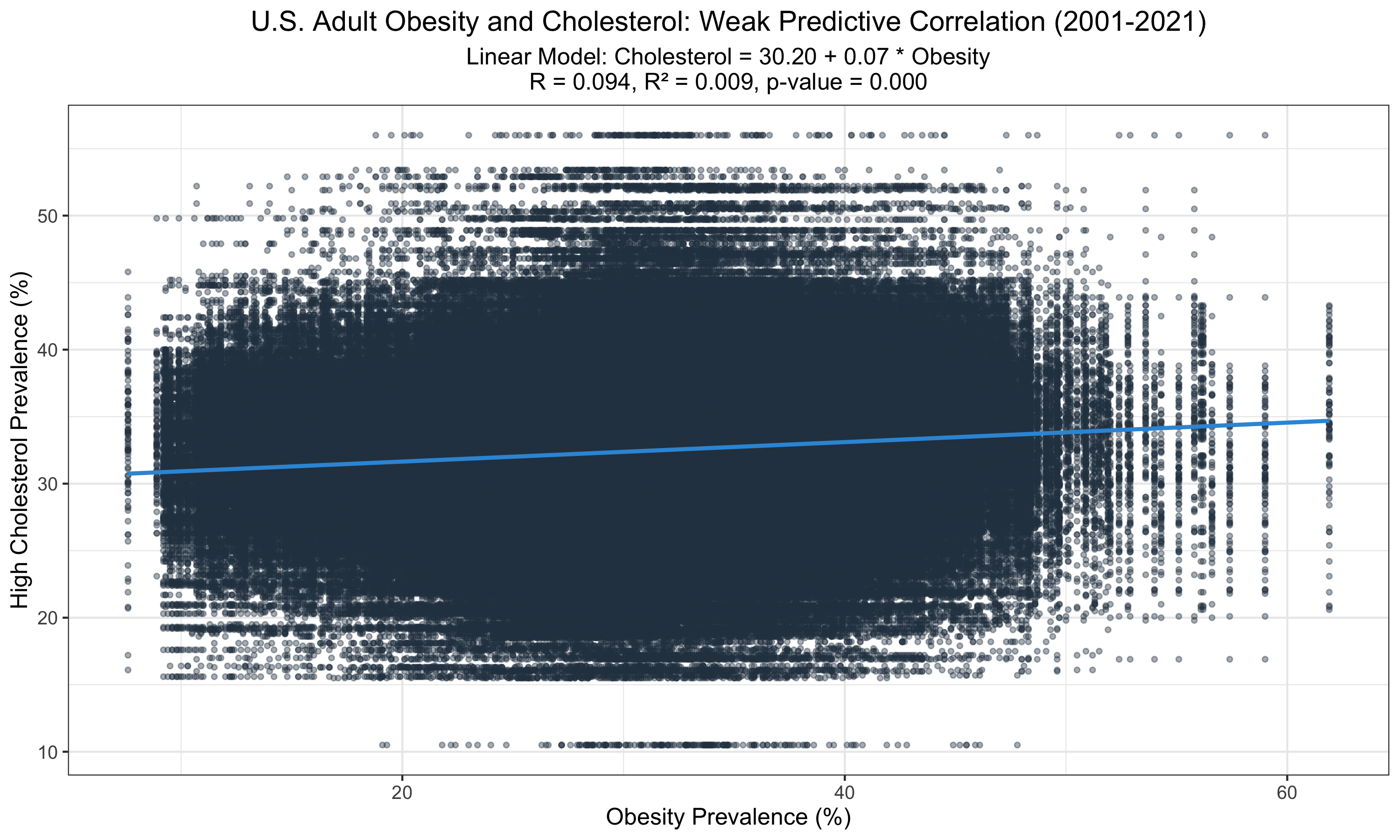
This graph displays a statistically significant relationship between obesity and high cholesterol prevalence among U.S. adults from 2001 to 2021. Despite the significance (p < 0.001), the low R-value (0.09) and R² (0.009) suggest that obesity alone poorly predicts cholesterol levels, indicating other factors may play substantial roles in cholesterol variability.
Alcohol Consumption and Mortality
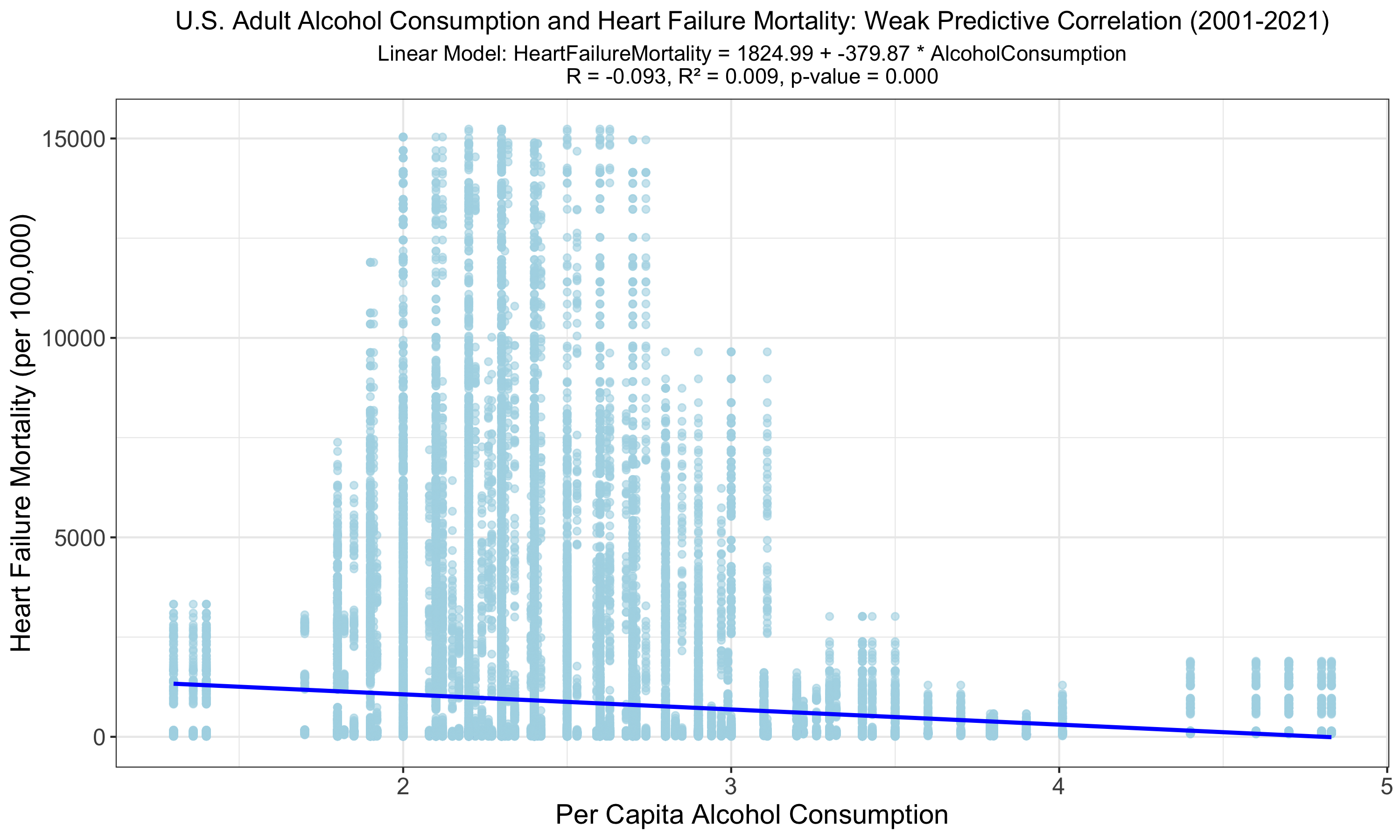
This graph reveals a statistically significant yet weak inverse relationship between U.S. adult alcohol consumption and heart failure mortality from 2001 to 2021. Despite the low R of -0.093 and R² of 0.009, indicating minimal variance explained, the model's p-value suggests the relationship is unlikely due to random chance. Given that a negative correlation is counterintuitive, this could be due to limited high consumption data, bias, or confounding variables.
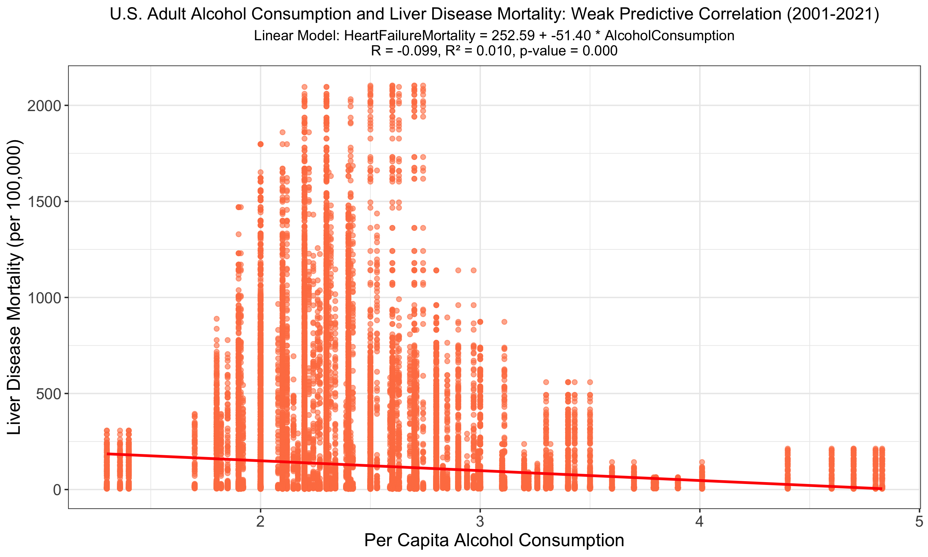
The graph depicts a linear regression analysis of U.S. adult alcohol consumption against liver disease mortality, highlighting a statistically significant but weak negative correlation (R = -0.099, R² = 0.010, p-value < 0.001). The low R² value suggests that alcohol consumption alone does not strongly predict liver disease mortality rates. A negative correlation is counterintuitive, possibly due to limited high consumption data, bias, or confounding variables.
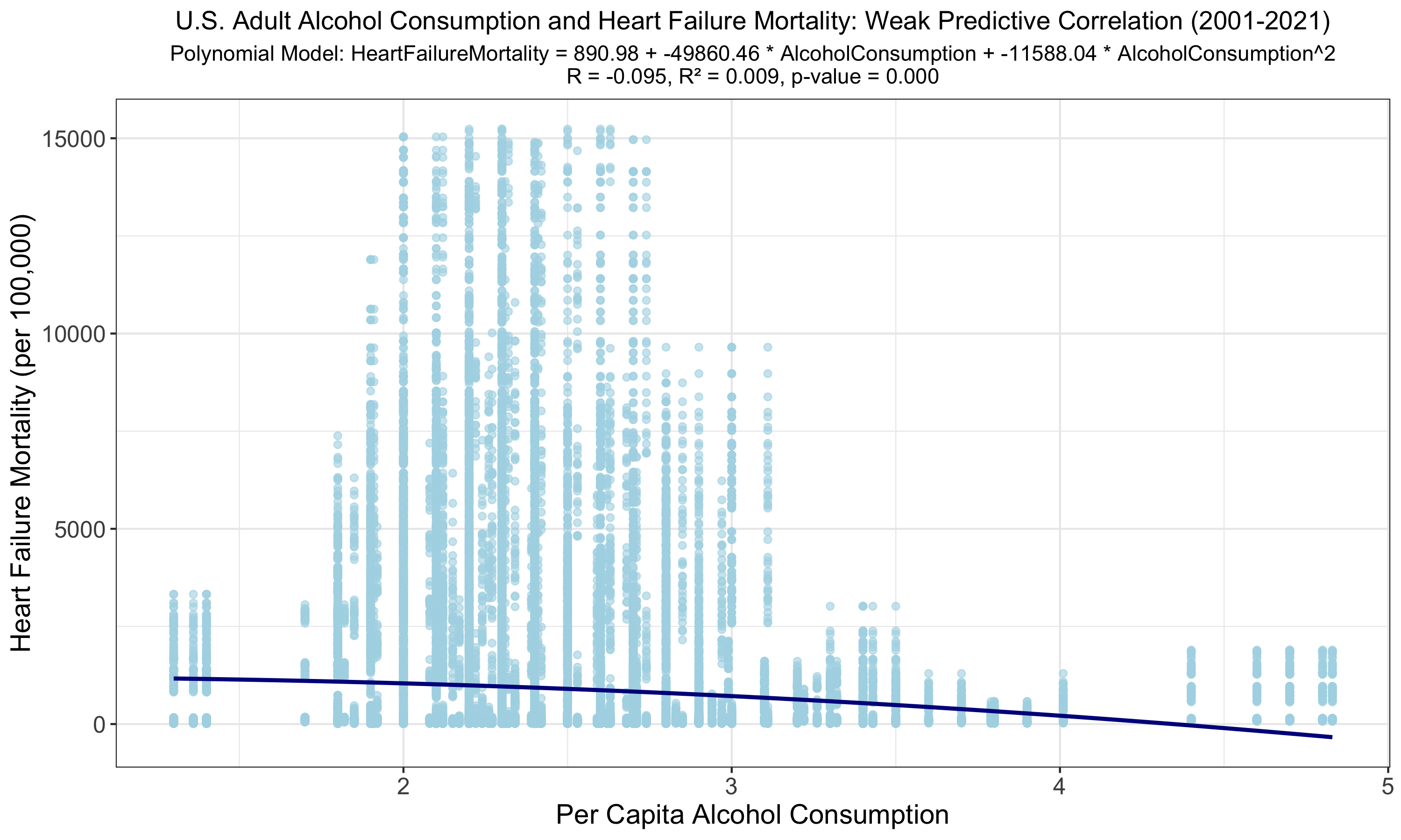
The polynomial regression yields a slightly improved but still weak correlation (R = -0.095, R² = 0.009) between alcohol consumption and heart failure mortality. A p-value of 0.000 suggests a relationship, yet the minimal increase in R and R² offers little practical predictive improvement over the linear model. The negative correlation suggests a limitation given few heavy drinkers within our consumption data or from bias/confounding variables.
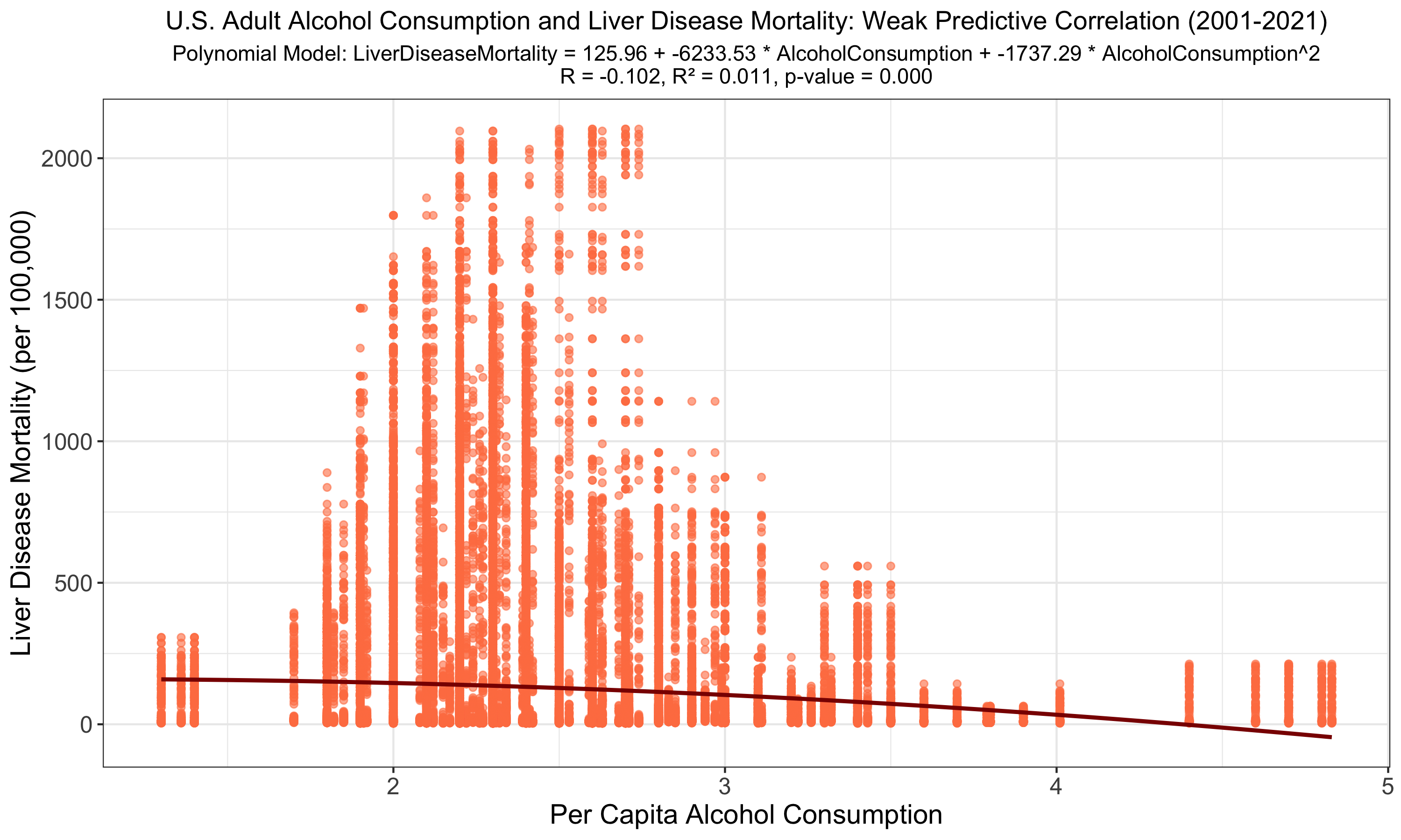
The polynomial regression slightly refines the correlation between alcohol consumption and liver disease mortality (R = -0.102, R² = 0.011, p-value < 0.001); however, like the linear model, it demonstrates that alcohol consumption alone does not robustly predict mortality outcomes. Here again, the negative correlation suggests limited heavy drinker consumption data or bias/confounding variables.
Youth Tobacco Use
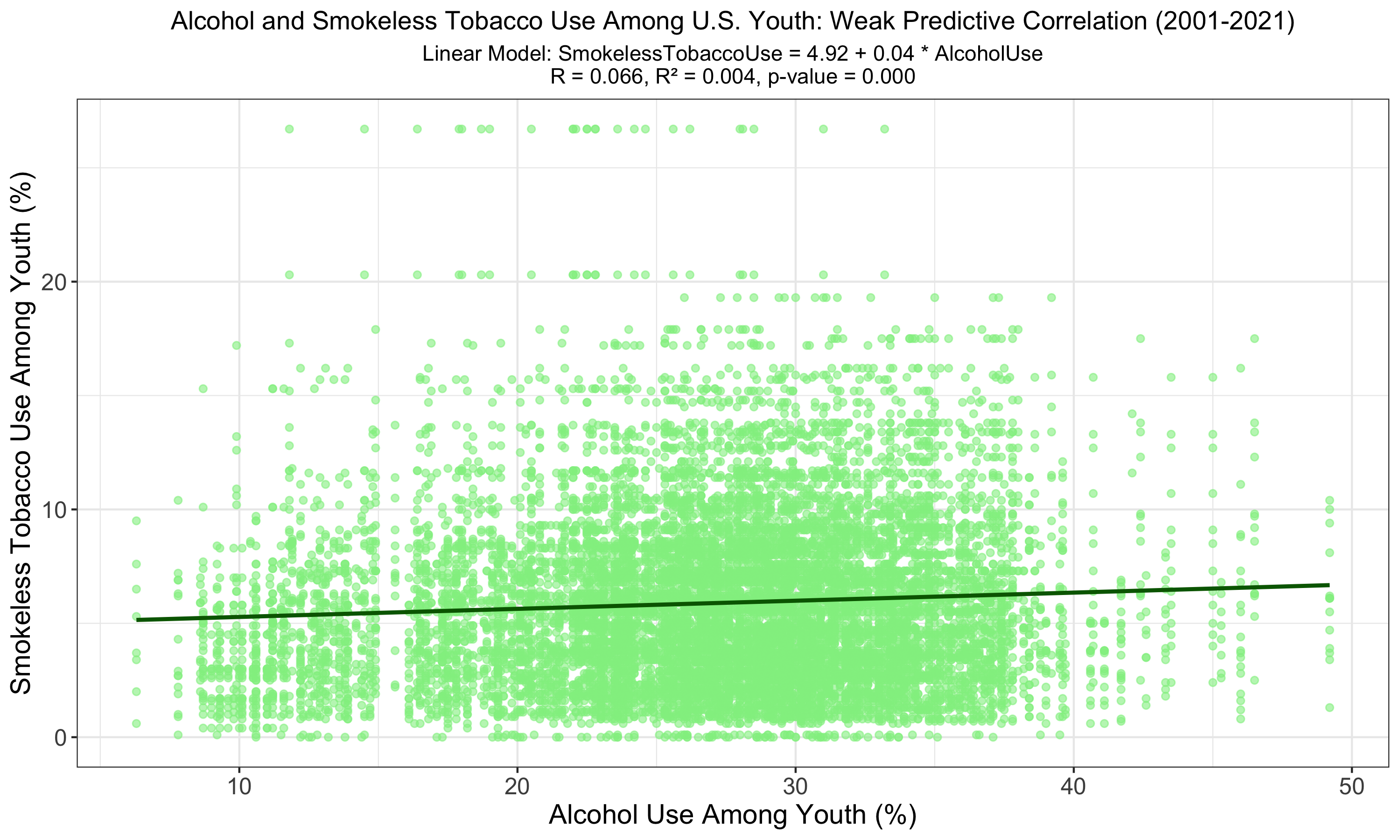
The graph shows a linear relationship between alcohol use and smokeless tobacco use among U.S. youth, with a very low R of 0.066 and an R² of 0.004, indicating a weak predictive power. The significant p-value (p < 0.001) suggests a relationship, although it accounts for a very small fraction of the variation in smokeless tobacco use.
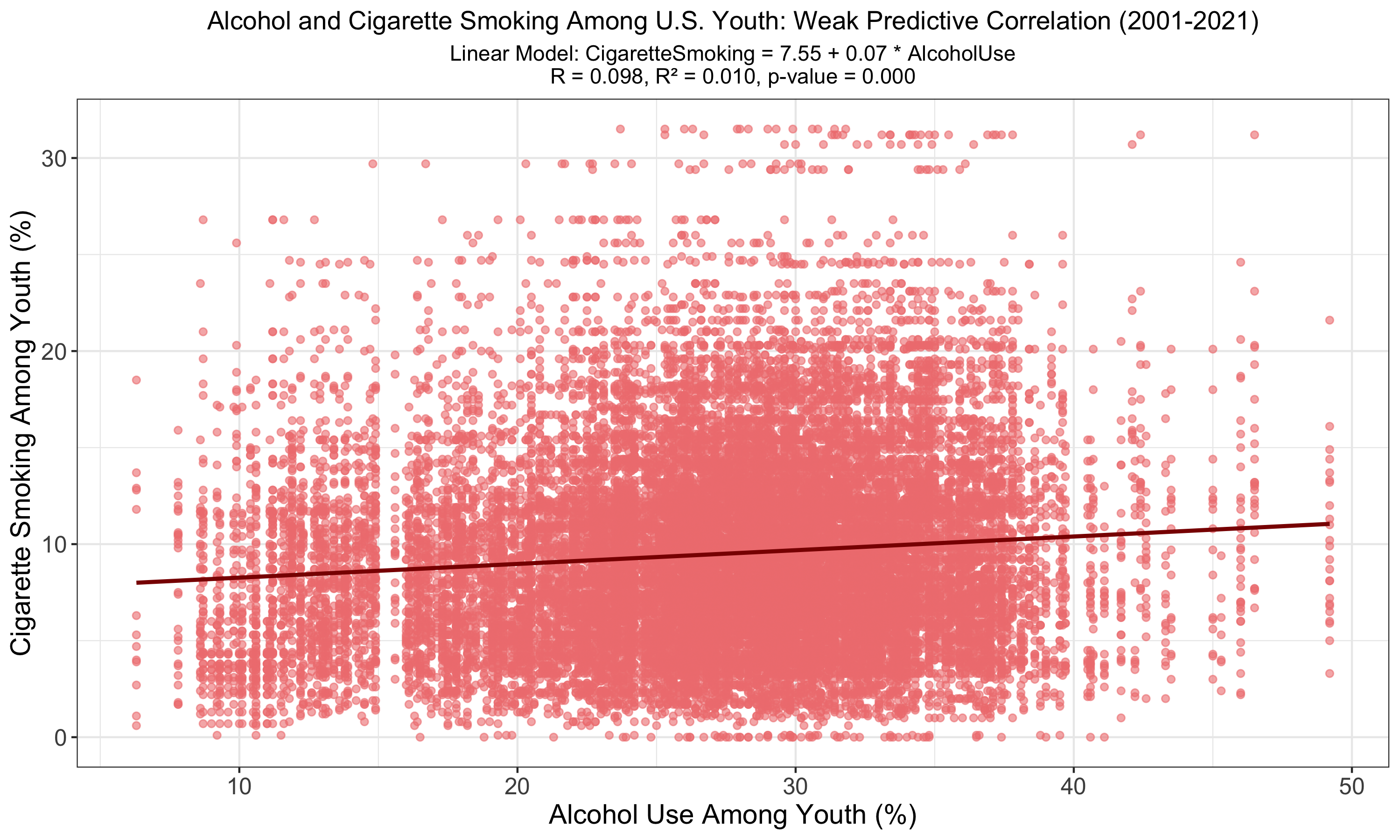
The chart illustrates a linear model between alcohol use and cigarette smoking among U.S. youth, revealing a weak positive correlation (R = 0.098, R² = 0.010) with a statistically significant p-value (p < 0.001). The model suggests a relationship exists, though it explains only a small portion of the variance in youth smoking behavior.
PE Participation and Obesity
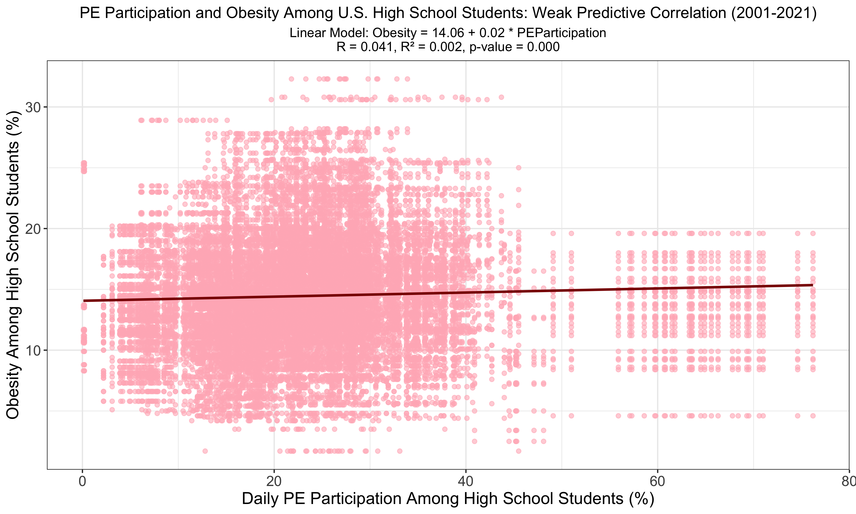
The graph presents a linear analysis of daily physical education (PE) participation against obesity rates among U.S. high school students, uncovering a statistically significant but very weak correlation (R = 0.041, R² = 0.002). The model's negligible R² value, alongside a p-value of less than 0.001, suggests that, while PE participation is associated with obesity levels, it is a weak predictor of the overall obesity rate among students.
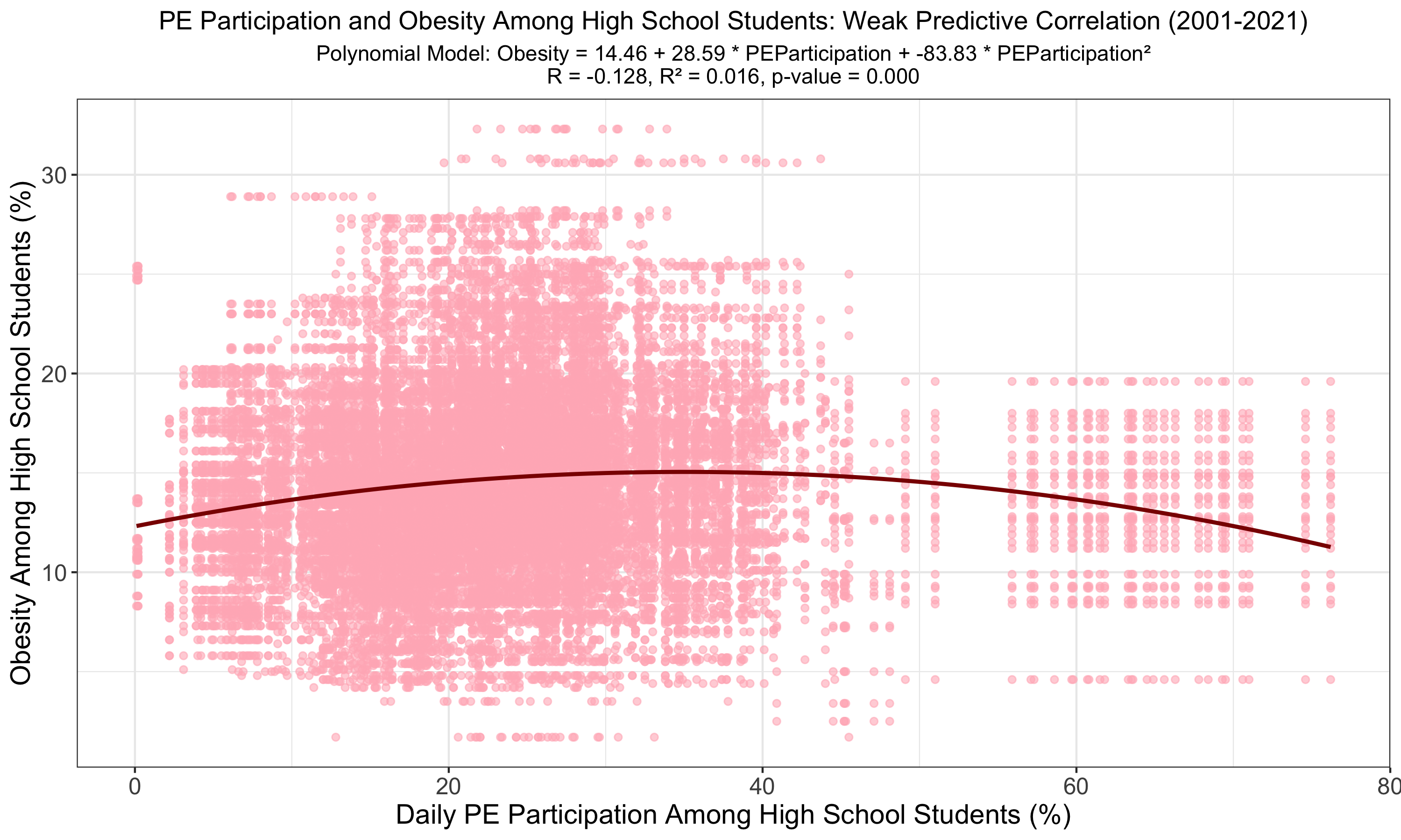
The polynomial model suggests a stronger correlation between PE participation and obesity among high school students compared to the linear model, with the absolute value of R increasing (R = -0.128) and R² to 0.016. Despite the low R², the significant p-value (p < 0.001) indicates a more complex, yet still weak, predictive relationship. Given the negative correlation, it is likely a polynomial fit is not applicable for this relationship.
Fluoridation and Tooth Loss
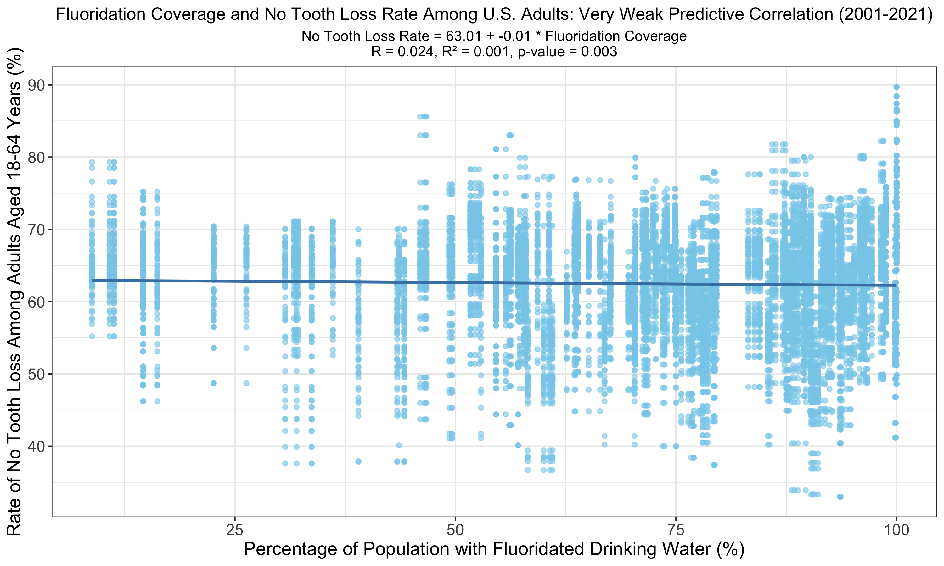
The graph illustrates a linear relationship between fluoridation coverage and no tooth loss among U.S. adults, displaying a very weak correlation (R = 0.024, R² = 0.001). The p-value of 0.003, while still indicating statistical significance, suggests that the predictive power of fluoridation on tooth retention is smaller than the predictive power of other models on this page with p-values of less than 0.001.
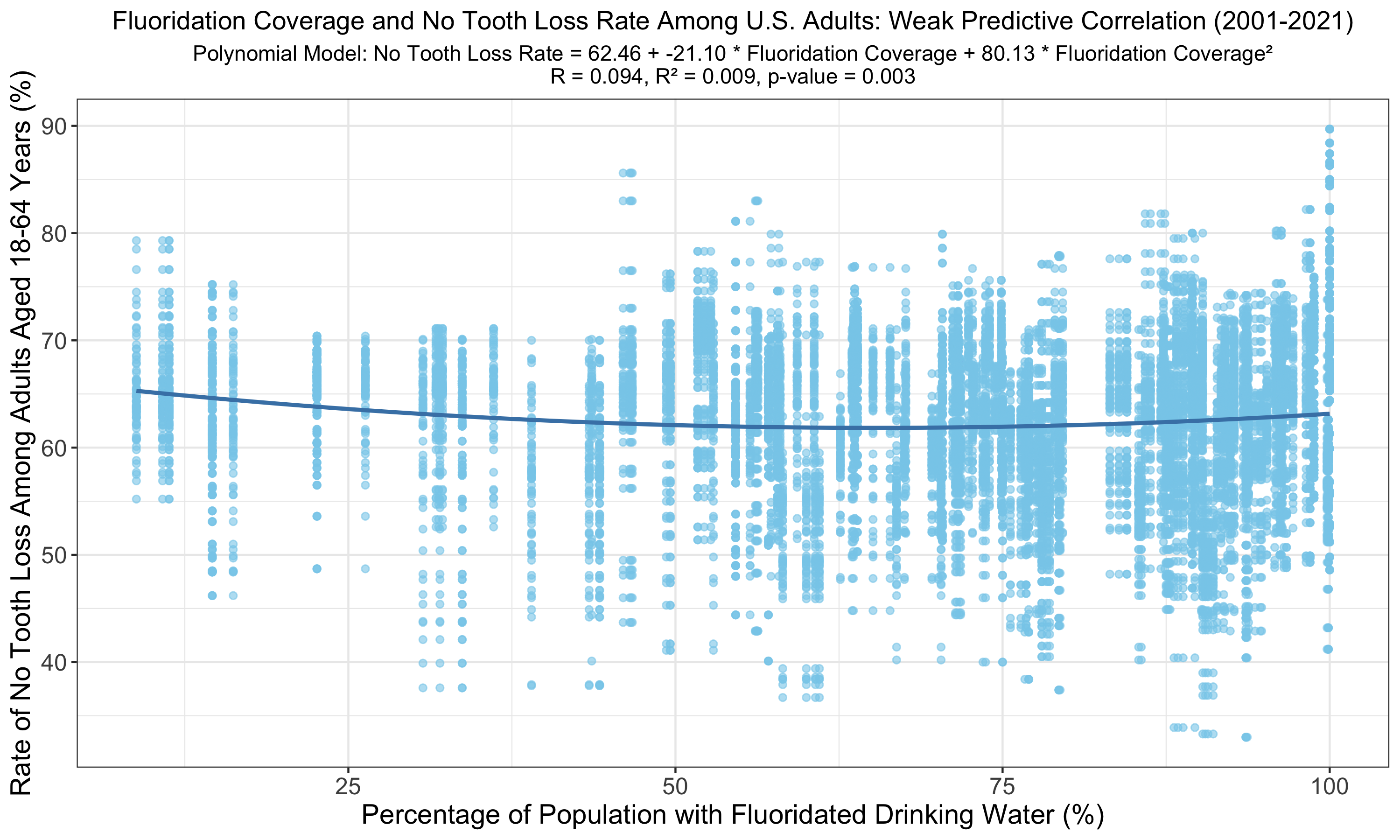
The polynomial model reveals an increased but still weak correlation between fluoridation coverage and no tooth loss among U.S. adults (R = 0.094, R² = 0.009) compared to the linear model. Despite higher R and R² values, the p-value of 0.003 indicates the relationship, although statistically valid, explains a smaller proportion of the variance in adult tooth retention rates than the variance predicted by other models with p < 0.001.
Farmers Markets and Healthy Consumption
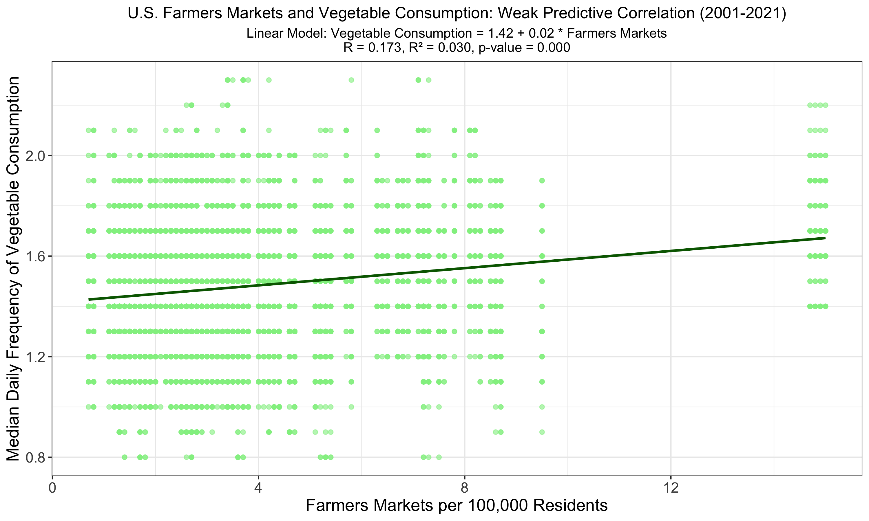
The graph indicates a linear relationship between the number of farmers markets and vegetable consumption among U.S. adults, with the highest observed R of 0.173 and R² of 0.030, signifying a weak yet more pronounced correlation than previous models. Despite being statistically significant (p < 0.001), the low R² value shows that farmers market availability weakly predicts vegetable consumption.
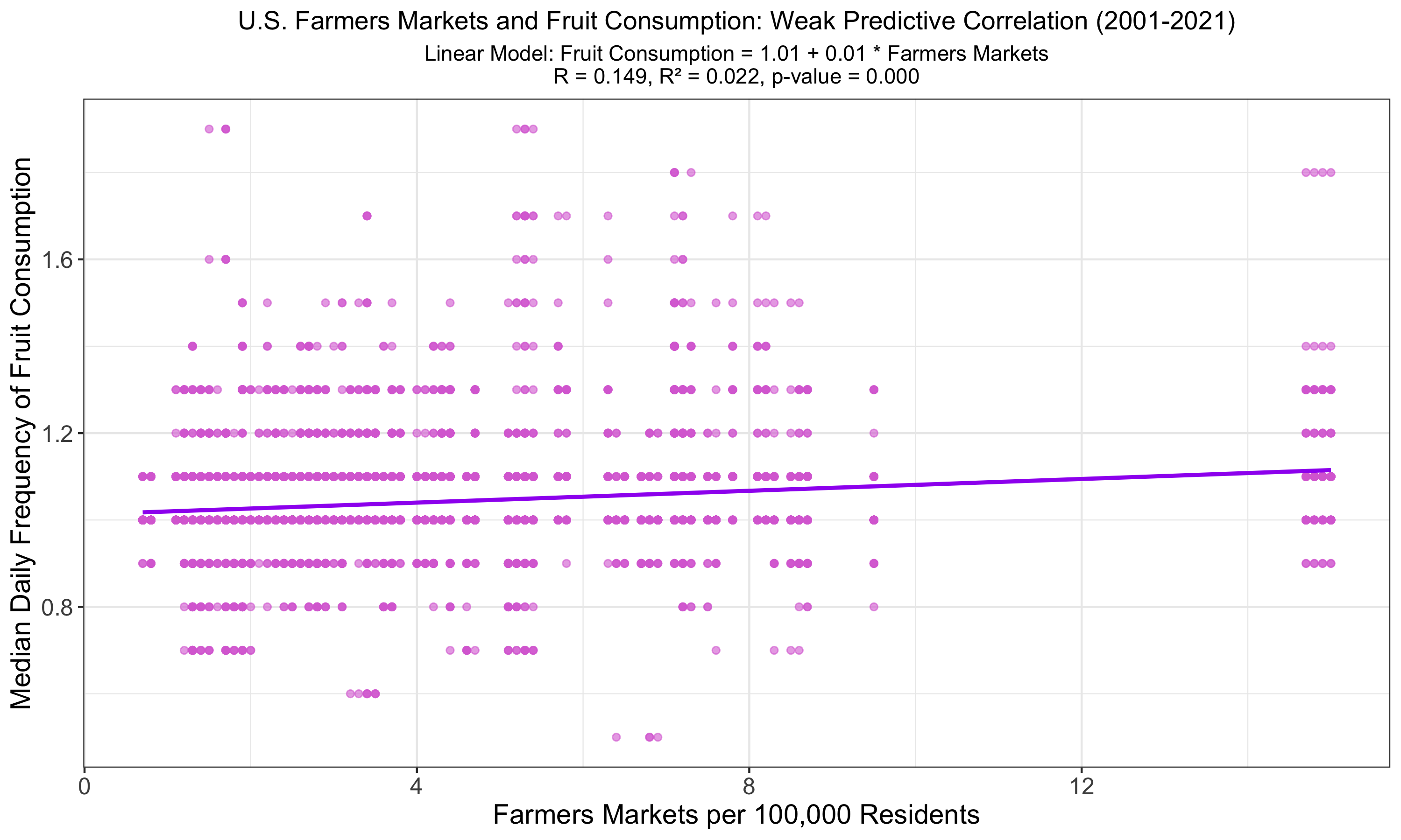
The graph shows a linear regression of fruit consumption against farmers market availability in the U.S., indicating a weak correlation with an R of 0.149 and R² of 0.022, slightly lower than for vegetables. Despite statistical significance (p < 0.001), these metrics underscore that other factors likely play a more substantial role in influencing fruit consumption habits among adults.
Follow-Up Questions
Given the difficulty in drawing conclusions from the above relationships demonstrated in these first 13 visualizations, I devised 3 additional follow-up questions to explore the predictive power of “combined” relationships, where two variables together are evaluated on their collective ability to predict a third variable. After initially attempting Ridge regressions to combine variables, I realized given the vast dataset size I had to create “summed” variables to represent my combined variables. Additionally, I labeled the data points by Location to provide supplemental insight.
- Mortality Predicting Alcohol Consumption: Does higher heart failure mortality and higher liver disease mortality together (among adults) together predict higher alcohol consumption?
- Cholesterol, Lack of Leisure-Time, and Obesity: Does higher cholesterol and lack of leisure-time physical activity together (among adults) predict higher obesity?
- Fruit and Vegetable Consumption and Tooth Loss: Is there a relationship between higher fruit and vegetable consumption together (among adults) and less tooth loss?
Mortality Predicting Alcohol Consumption
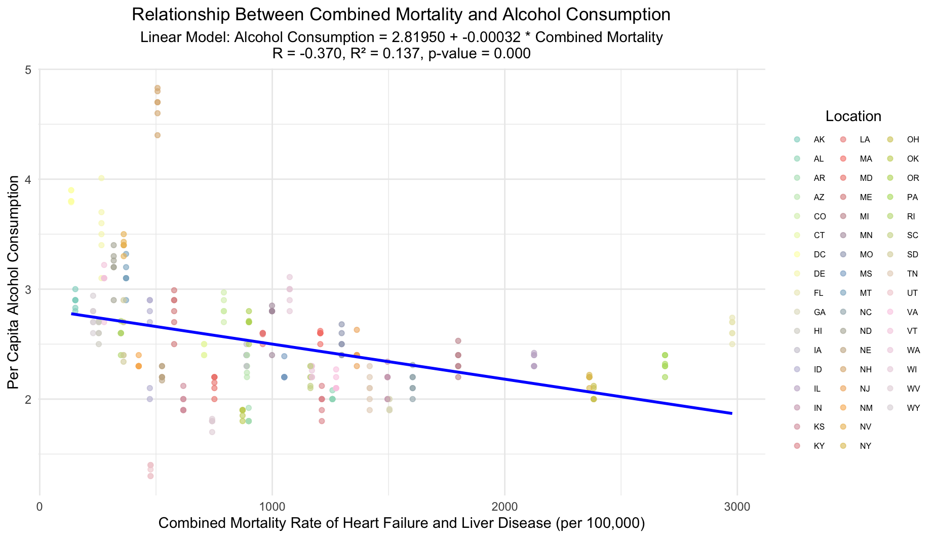
This plot illustrates the weak negative correlation between combined heart failure and liver disease mortality rates and alcohol consumption across U.S. locations, each uniquely marked. Mortality rates were summed to form a single predictor variable. The linear model suggests minimal predictive power with an R value of -0.370 and an R² value of 0.137, yet the relationship is statistically significant (p-value < 0.001).
Cholesterol, Lack of Leisure-Time, and Obesity
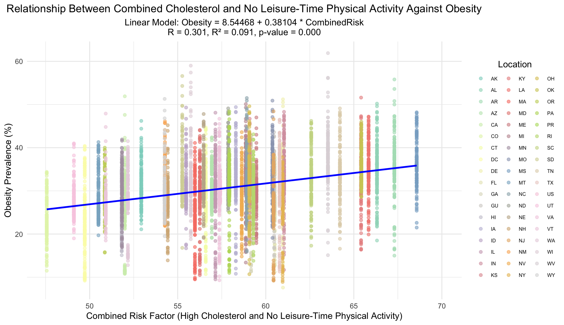
The plot illustrates the impact of a combined risk factor—sum of high cholesterol prevalence and lack of leisure-time physical activity on obesity rates. Each location is uniquely marked by color and shape for more visual distinction. Despite a statistically significant model (p-value = 0.000), the R-value of 0.301 and R-squared of 0.091 suggest only a modest correlation between the combined risk factor and obesity prevalence.
Fruit and Vegetable Consumption and Tooth Loss
This plot could not be created due to NA values stemming from the stringent filtering criteria applied after creating a CombinedConsumption variable. Essentially, after attempting to join the data frames, there were insufficient non-NA observations to construct a valid linear model between the combined variable and the No Tooth Loss variable.
Conclusion
As we have seen, it is clear that various indicators show interesting statistically significant relationships. Nevertheless, we cannot make direct conclusions about health outcomes using only two indicators, even after exploring polynomial fits. After creating combined variables in the follow-up questions, we continued to see a similar limitation in predictive power. In healthcare, it is best to take a holistic approach to improve outcomes, given that the effect of one or two indicators on overall health is compounded across the wide-range of linked biological pathways.
My conclusion for this data exploration is that certain lifestyle choices, government policies, and community resources can effect individual health outcomes, but it can be difficult to make any sort of definitive conclusion about what one indicator will reveal in terms of population-wide health. For example, higher alcohol consumption may be linked to higher cigarette smoking among youth, but this is certainly not a universal guarantee. Additionally, it is important to note the possible presence of confounding variables, such as geographic representation within the U.S., where different regions contain significantly different populations that are difficult to compare. We must also consider the presence and impact of possible biases (noncoverage, nonresponse, and measurement errors). The limited scope of the dataset for some particular indicators could also help explain the negative correlations we saw between alcohol consumption and two mortality types (heart failure and liver disease).
My hope for this project is that anyone who examines its statistical analyses keeps in mind their unique context, as well as remembering that this dataset, despite being vast, is limited by the fact that it does not consistently capture every state/territory for every unique indicator. Even more importantly, I hope that readers come away with an understanding that making health outcome predictions from a model between two variables is extremely difficult. Ultimately, my main takeaway from this project is the insightful wisdom that we can impact our health with our own choices, and I hope to be able to use this sharpened understanding in my own life, for both myself and for the people I care most about.
Sources
Here you can download this vast dataset in a variety of formats. The CSV version was used in this analysis.