Let us discover the power of PivotTables.
Table of Contents
What
Why
How
Product Sales (Dataset 1)
Employee Attendance (Dataset 2)
Data
What
In this tutorial on PivotTables in Microsoft Excel, we will learn how this powerful tool can be used to summarize, analyze, explore, and present your data. PivotTables allow us to easily rearrange and manipulate large amounts of data in a dynamic way, offering insights and patterns that might not be immediately evident. We can group and sort data, as well as perform calculations like sums, averages, and counts, all with simple drag-and-drop functionality. PivotTables are ideal for large datasets, where we can create concise reports and visualizations, making our data more accessible and understandable. We can also refresh our PivotTables as our datasets change, allowing for seamless updates of these reports and visualizations.
Why
PivotTables are an invaluable tool for dealing with large and complex datasets, such as business analysts, researchers, or financial professionals. They are particularly useful for summarizing and analyzing data, allowing us to spot trends, patterns, and anomalies quickly. Example uses could include creating comprehensive sales reports, performing customer segmentation, or analyzing financial data. PivotTables offer a flexible and efficient way to rearrange, group, and summarize data. They are also extremely helpful in preparing data for presentations or decision-making, as they can turn extensive datasets into concise tables and clear charts. In essence, PivotTables save time and enhance the clarity of data analysis.
How
Product Sales (Dataset 1)
Step 1: Data Preparation
- Ensure the dataset is in a table format with clear headers.
- Each column should have a unique name (i.e. Date, Product Category, Salesperson, etc.).
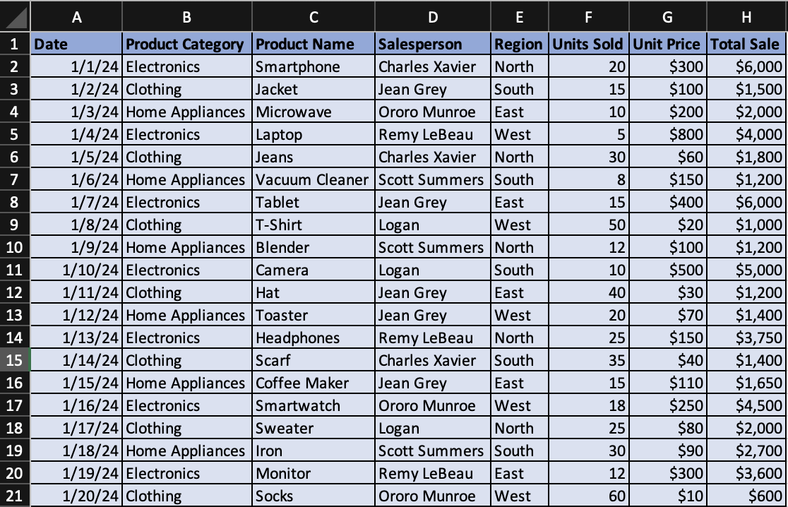
An example dataset formatted correctly in Excel.
Step 2: Inserting a PivotTable
- Click anywhere inside your dataset.
- Navigate to the “Insert” tab on the Excel ribbon.
- Click on “PivotTable”.
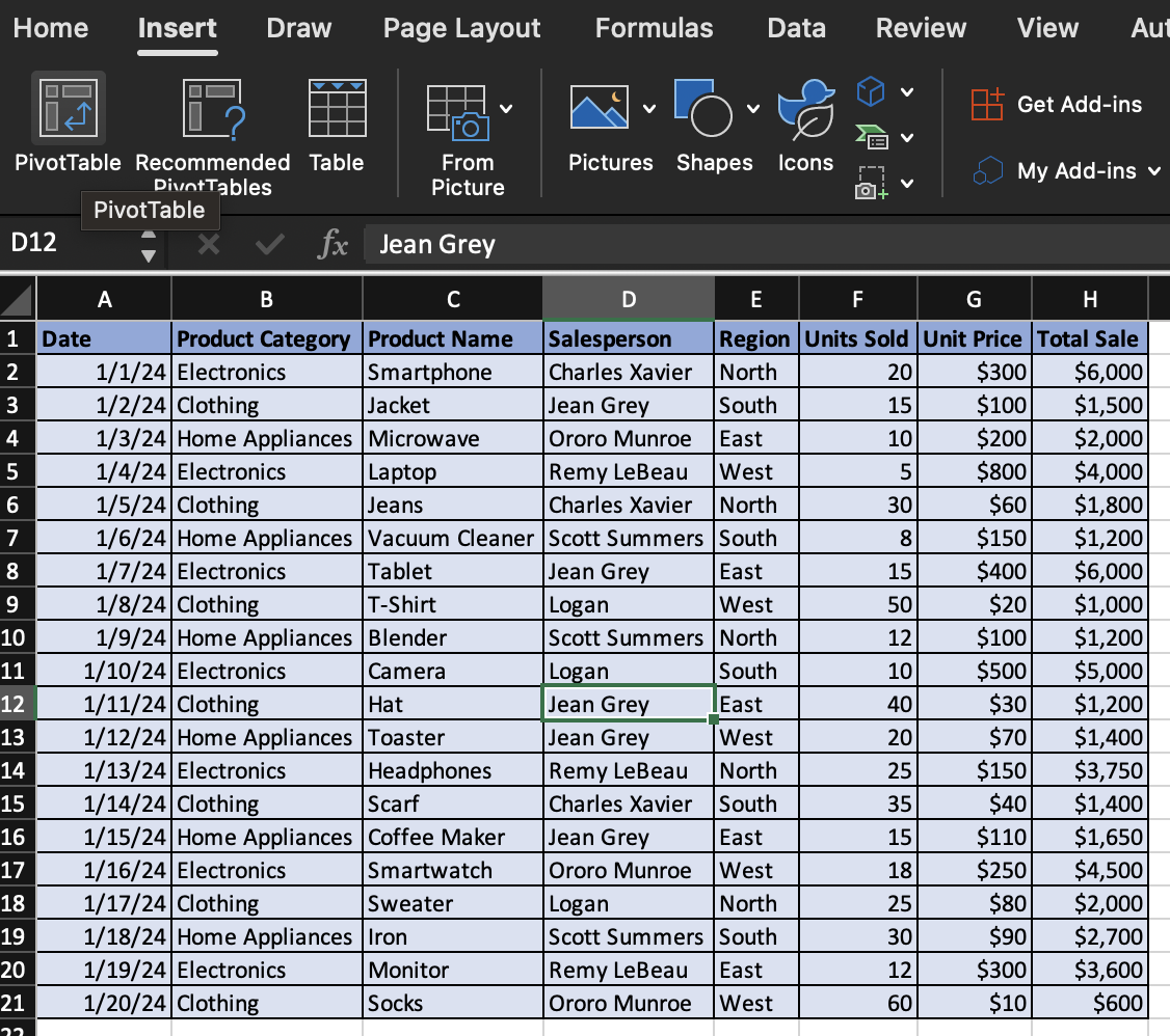
"PivotTable" option in ribbon.
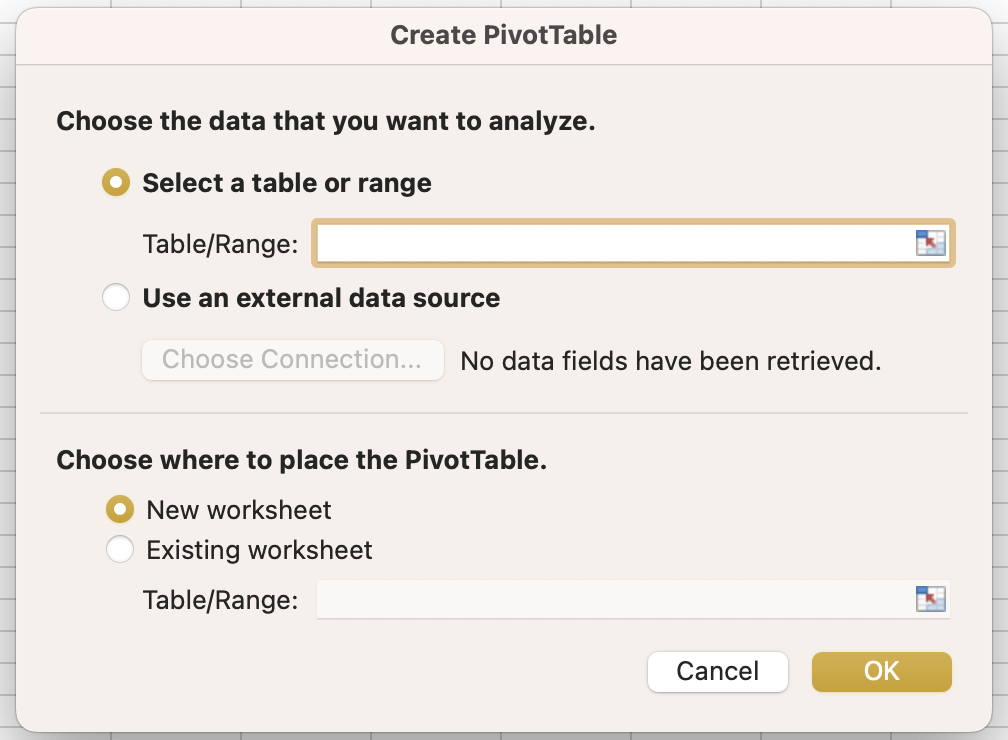
- In the “Create PivotTable” dialog box, ensure your table range is correct and choose where you want the PivotTable to be placed (New Worksheet is often preferred for clarity). You can rename the Sheet where you PivotTable is populated.

Create PivotTable dialog box.
New sheet.
Step 3: Setting Up PivotTable
- In the PivotTable Fields pane, drag “Product Category” to the Rows field.
- Notice the four different “PivotTable Fields” on the right.
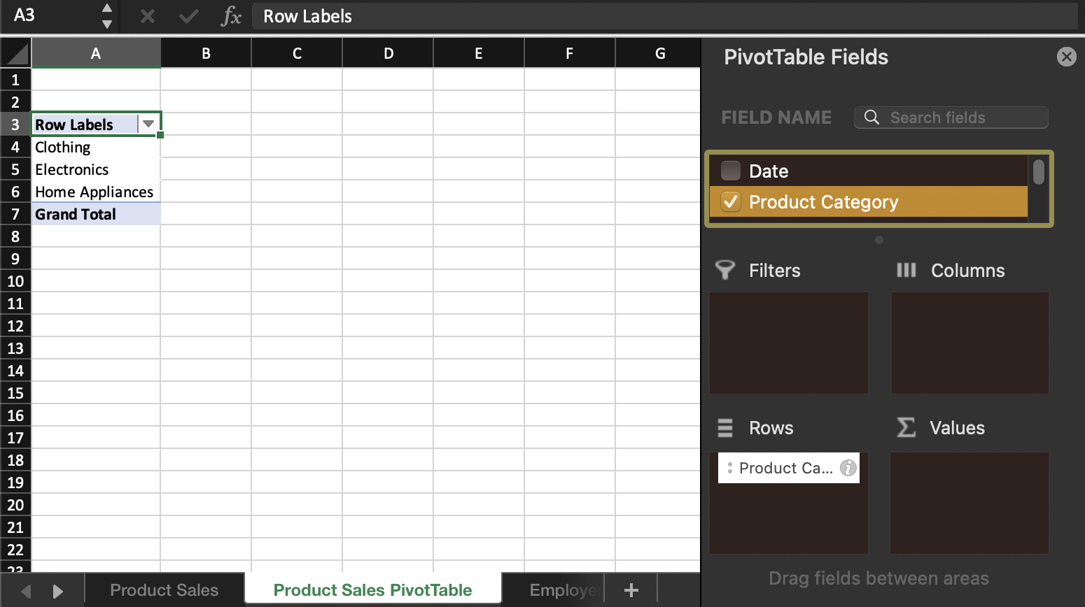
"Product Category" to Rows.
- The Rows field populates the rows in your PivotTable, the Columns field populates the columns in your PivotTable, and the Values field populates the intersection of the rows and columns in the interior of your PivotTable.
- The Filters field can be used to narrow down the scope of the data included in your PivotTable by a particular attribute from your original dataset (i.e. only include a certain region).
- Drag “Total Sale” to the Values area. By default, Excel will sum the values.
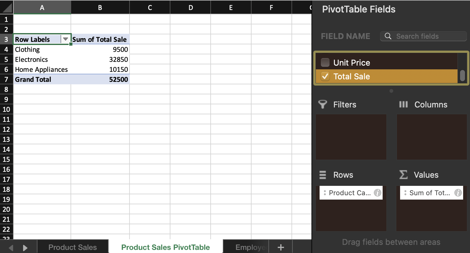
"Total Sale" to Values.
- This setup will show the total sales per category.
Step 4: Adding a Layer to Identify Top Salesperson
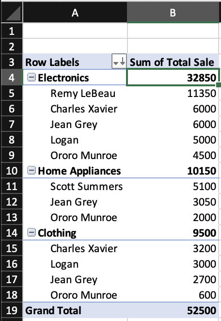
- Drag “Salesperson” to the Rows area, placing it below “Product Category”. This will breakdown the sales within each category by salesperson.
- Now, the PivotTable shows total sales per category and further breaks it down by each salesperson.
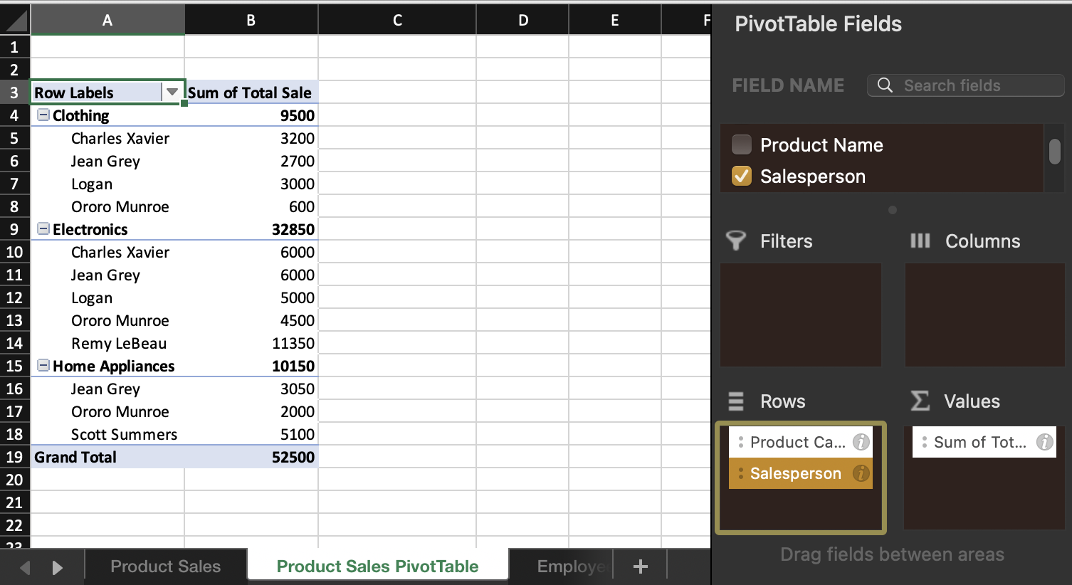
Updated PivotTable with both categories and salesperson details.
Step 5: Sorting to Identify Best-Selling Category and Top Salesperson
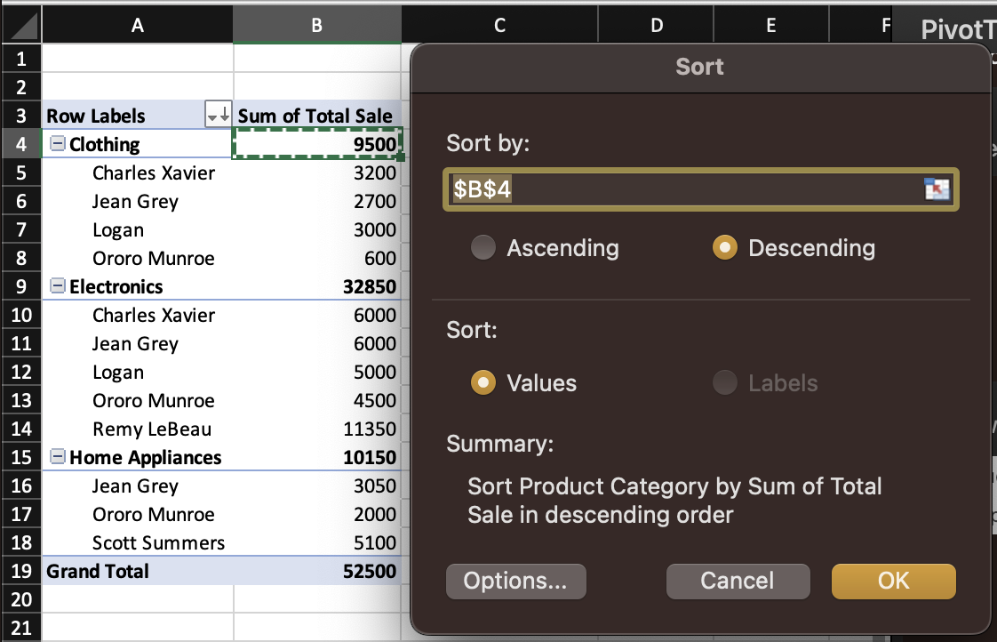
- Click on any number in the “Sum of Total Sale” column that corresponds to a “Product Category”.
- Go to the “Data” tab, select Sort & Filter, and choose the “Descending” feature. Ensure that the Summary description matches your intended results. It should read “Sort Product Category by Sum of Total Sale in descending order”. Select OK.
Sort dialog box.
- This sorts categories by total sales and salespeople by total sales within each category.
After Sort.
Step 6: Analyzing and Interpreting the Data
- The top item in the PivotTable is now the best-selling category.
- Within each category, the top-listed salesperson is the one with the highest sales.
- These top results were manually highlighted for clarity.
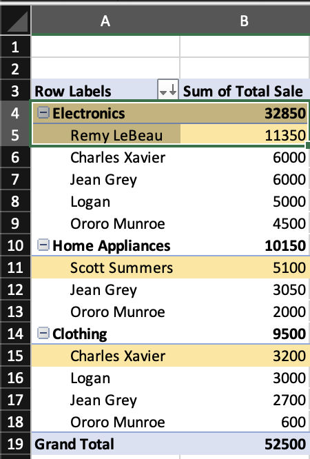
Highlighted top of the list.
This PivotTable helps in quickly identifying which categories are most lucrative and which salespeople are performing best in each category. Such insights are essential for strategic decision-making in sales management, like incentivizing top performers, allocating resources, or tailoring marketing strategies based on successful categories.
PivotTables are dynamic. As the dataset updates/grows, we can refresh the PivotTable to reflect the latest data. This makes them incredibly powerful for ongoing analysis.
Employee Attendance (Dataset 2)
Step 1: Data Preparation
- Ensure the dataset is in a table format with clear headers.
- Each column should have a unique name (i.e. Date, Product Category, Salesperson, etc.).
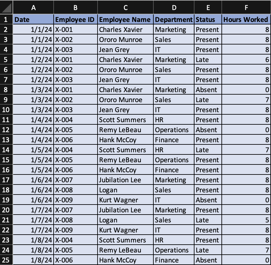
An example dataset formatted correctly in Excel.
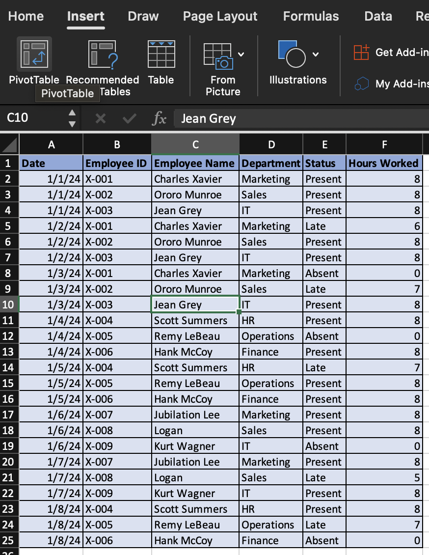
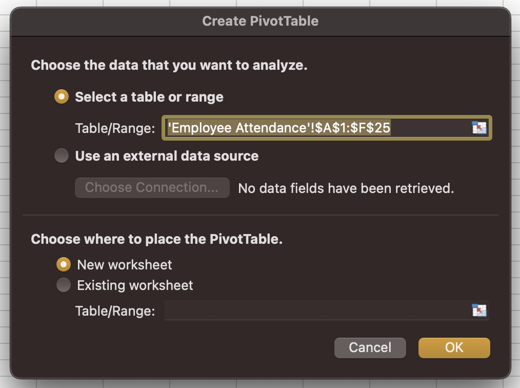
Step 2: Inserting a PivotTable
- Click anywhere inside your dataset.
- Navigate to the “Insert” tab on the Excel ribbon and click “PivotTable”.
"PivotTable" option in ribbon.
"PivotTable" dialog box.
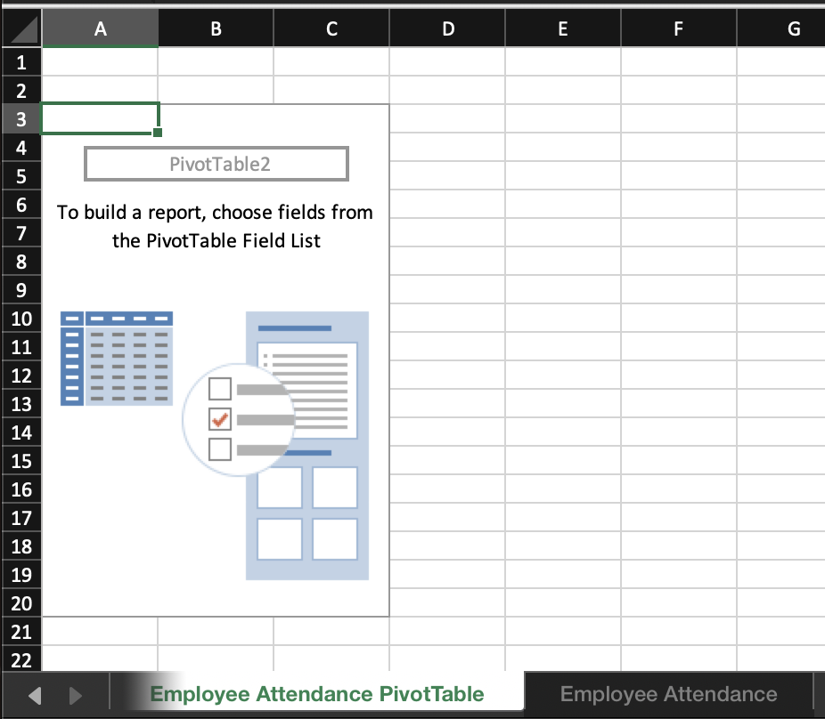
- In the “Create PivotTable” dialog box, ensure your table range is correct and choose where you want the Pivot Table to be placed (New Worksheet is often preferred for clarity). As with Dataset 1, you can rename the new Sheet.
Renamed sheet.
Step 3: Setting Up PivotTable
- In the “PivotTable Fields” pane, drag “Department” to the Rows area.
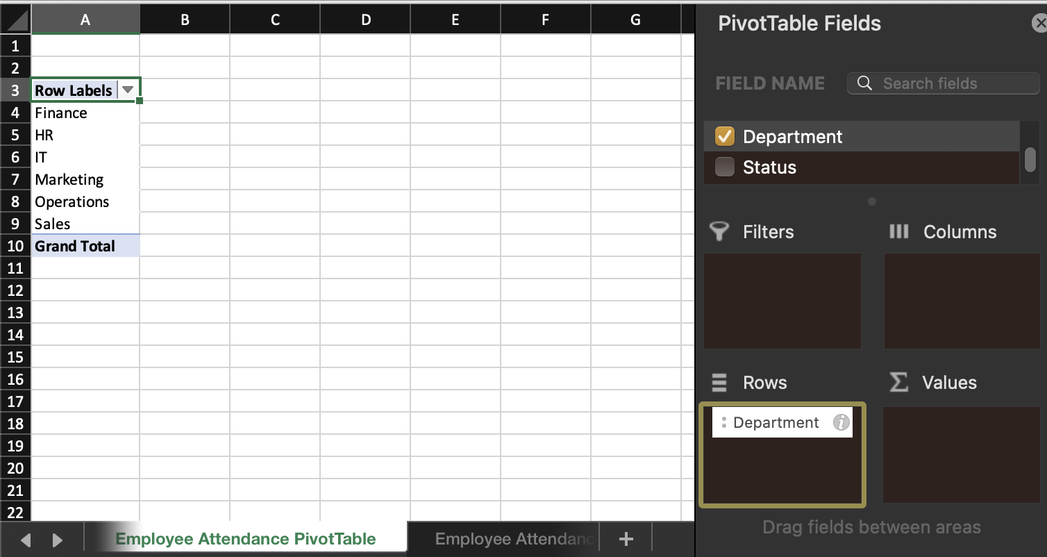
"Department" to Rows.
- Drag “Status” to the Columns area.
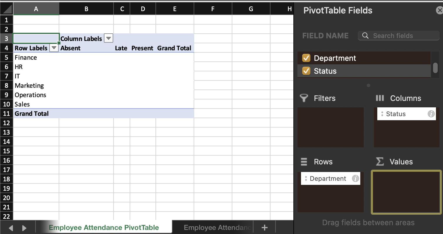
"Status" to Columns.
- Now drag “Status” to the Values area. The Field Setting should automatically set to “Count” (if not, adjust this setting accordingly).
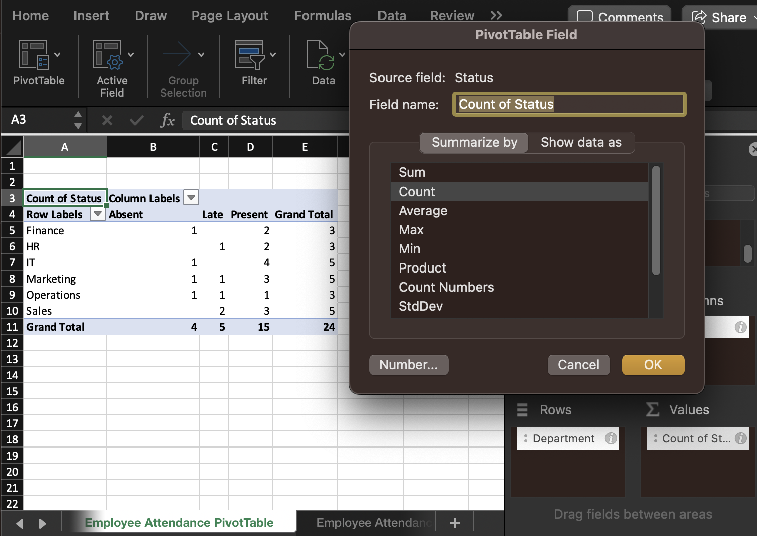
"Status" to Values and change setting to "Count."
- This setup provides a count of different attendance statuses (Present, Absent, Late) for each department.
Step 4: Setting Up PivotTable to Analyze Hours Worked
- Drag “Employee Name” below “Department” in Rows area.
- Drag “Hours Worked” to the Values area. By default, it will sum the hours.
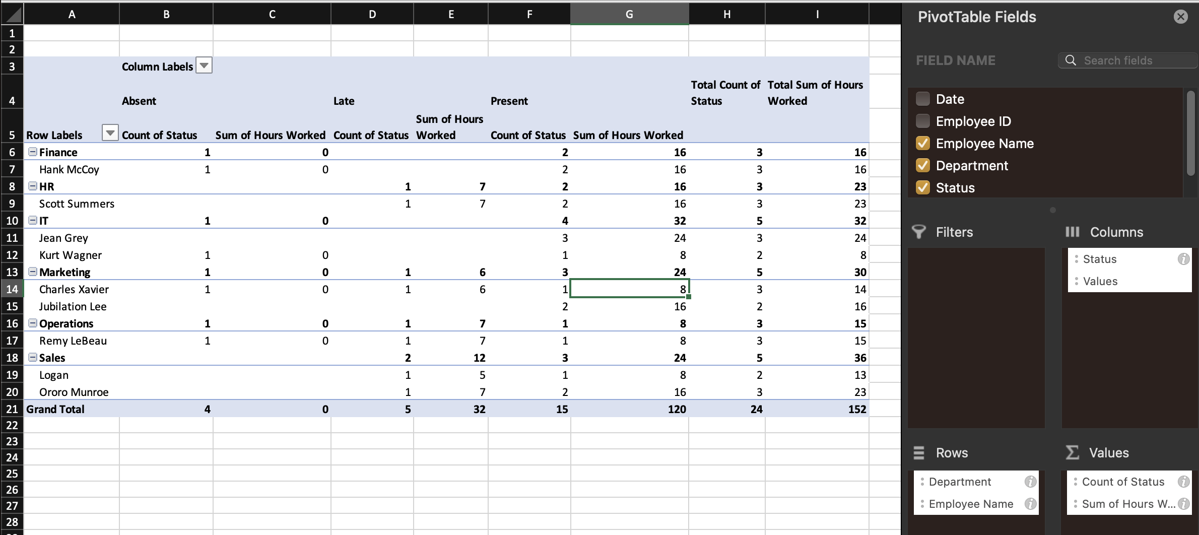
Showing hours worked.
- This setup shows the total hours worked by each employee and department.
Step 5: Sorting to Identify Departments and Employees with Most Hours Worked
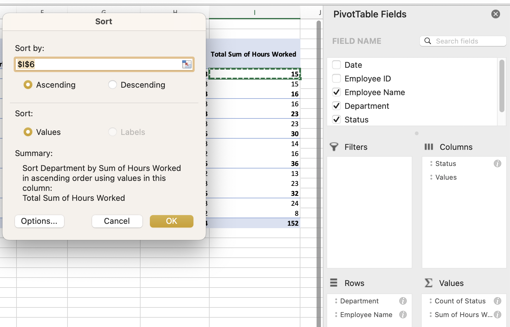
- Click on any number in the “Total Sum of Hours Worked” column that corresponds to a “department” row.
- Go to the “Data” tab, select Sort & Filter, and choose the “Ascending” feature.
- Ensure that the Summary description matches your intended results. It should read “Sort Department by Sum of Hours Worked in ascending order using values in this column: Total Sum of Hours Worked”. Select OK.
We sort departments and the associated employees smallest to largest.
- This sorts the departments based upon the total hours worked. It will also sort each department in ascending order by employee.
Step 6: Analyzing and Interpreting the Data
- The top item in your PivotTable now represents the department with the least hours worked (in this case, Operations).
- Within each department, the top-listed employee is the one with the least hours.
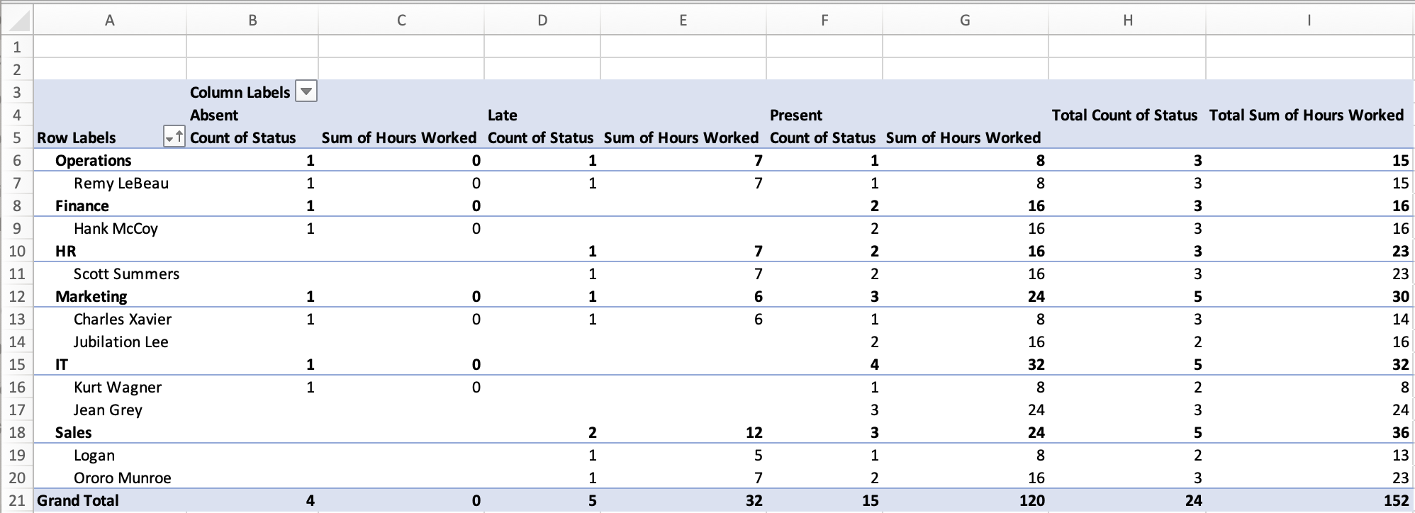
Final PivotTable with sorted results, revealing departments and employees with the least hours worked.
This analysis can help human resource managers understand attendance patterns and workload distribution across departments and employees. Such insights are crucial for managing workforce efficiency, identifying departments or employees that may be overburdened and ensuring equitable workload distribution.
As we mentioned above in our first example using Sales Data, we can refresh our PivotTables to reflect updated data, making them an effective tool for ongoing HR data analysis.
Data
Here you can find the two pseudo-datasets used above in a single Excel spreadsheet (.xlsx), with the PivotTables generated according to the above instructions. Additionally, a third pseudo-dataset is included to try out your skills on something new.